When you use data visualization techniques, you make it possible to explore parts of your data you otherwise may have overlooked. Companies use data visualization techniques all the time to make informed business decisions. Because we know a thing or two about effective data visualization techniques and visual content, we figured we’d share a few tips with you.
In this blog post, we’ll explore several data visualization examples and how you can use them.
Line Chart Data Visualization Technique
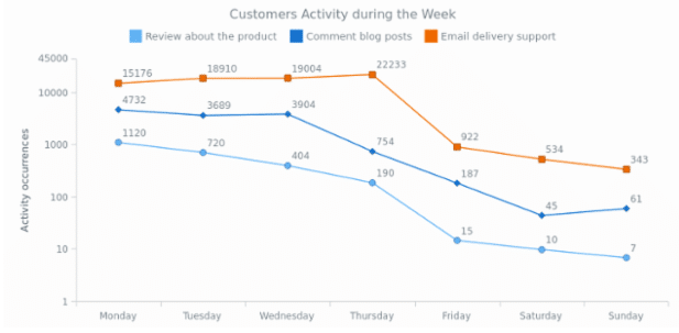
Line charts help businesses demonstrate overall trends. These charts are difficult to misinterpret because of their simplicity and conciseness. A lot of businesses use line chart data visualizations to highlight and compare trends that occur at the same time. Let’s take for example that you want to compare three different forms of customer activity throughout the week. Below is what your line chart could possibly look like.
Column Chart Data Visualization Technique
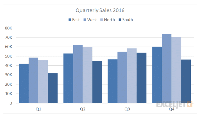
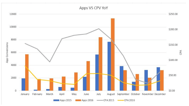
Column charts are an excellent data visualization technique to use when performing a side-by-side comparison of different values. These charts also prove valuable when your goal isn’t to draw attention to the shape of the trend, but rather to its total figures and how those figures change over time.
Let’s say you want to highlight quarterly sales for stores in various locations. In the example below, it’s easy to see that your brand’s North and West stores performed much better throughout the entire year than those in the East and South.
 Scatter Chart Data Visualization Technique
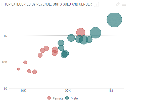
You can use a scatter chart data visualization technique when you want to highlight the distribution of two variables and how those distribution levels relate to one another. Categories are generally represented by the color of the circle, while the circle size demonstrates the volume of the data. Scatter charts make it simple to make informed business decisions by helping you realize where to focus your resources.
Let’s say you use the scatter chart data visualization technique to see whether males or females buy more of your products. In the example below, it’s simple to see that males buy more of your products than females. Knowing this information tells you to do two things: Continue focusing a heavy amount of marketing on the male population while also coming up with ways to better engage female shoppers.
 Bubble Chart Data Visualization Technique
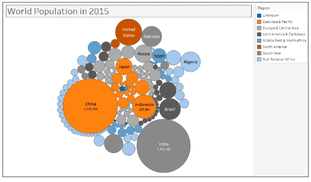
A bubble chart uses circles to reflect the weight of various values. The larger the circumference of the circle, the larger the weight of the value. Unlike scatter charts, bubble charts represent only one measurement per category. If your goal is to highlight how certain categories are insignificant compared to others, the bubble chart data visualization technique will serve incredibly useful.
The data visualization example below does a great job at showing how a bubble chart is valuable for highlighting the world population by country in 2015.
 Pie Chart Data Visualization Technique
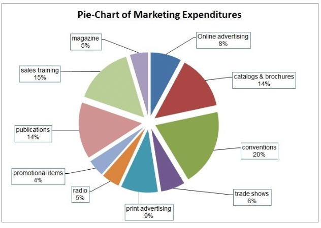
Pie charts prove beneficial when you want to compare how the value of different variables contributes to the overall whole of something. Let’s say you want to see how your marketing budget is getting spent. The below pie chart does an excellent job of showing you the various values of different marketing expenses and how they compare to one another.
With a simple glance, you automatically see that conventions are your biggest marketing expense, followed closely by the cost of sales training.
You can make many informed business decisions using pie charts. This data visualization technique is particularly valuable when you’re giving presentations during business meetings.
Pivot Table Data Visualization Example
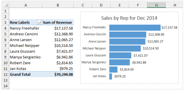
Although they aren’t the most attractive data visualization type, pivot tables make it easy to visualize key figures and exact numbers. This data visualization technique doesn’t depict a sense of trends, but it is especially ideal if you don’t have a self-service business intelligence (BI) tool to automate the extraction of key figures.
You can use Excel to create both pivot tables and pivot charts. For more on the various data visualization tools, check out this Forbes article.
Let’s say your goal is to compare revenue generation totals from different salespersons. The example below shows you how a pivot table and pivot chart make it easy to compare those revenue totals.
 Process for Effective Data Visualization
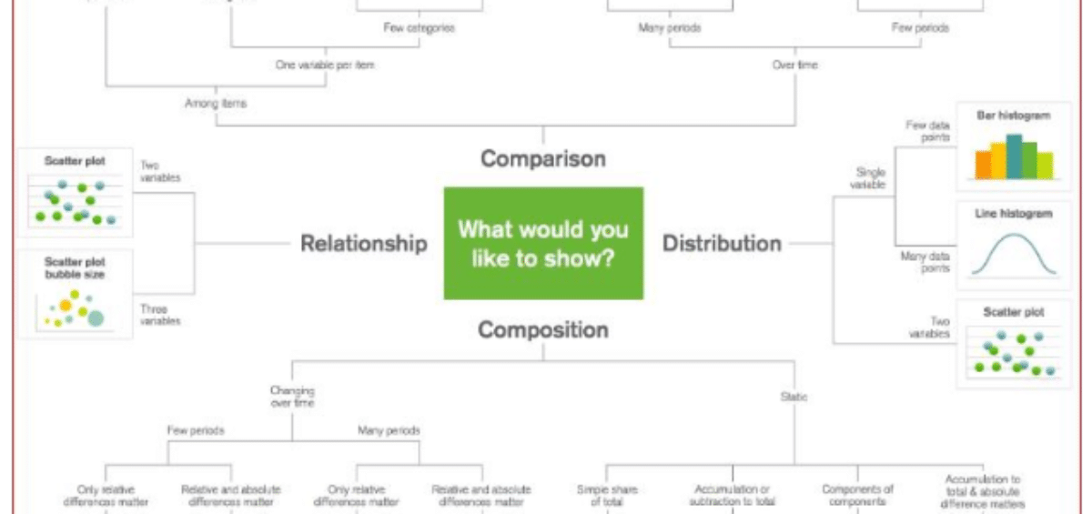
As you assess how to display data using data visualization techniques, it’s pertinent to start by considering the function and user. You can then choose a data visualization type/format to use. The function of the data visualization relates to the intended message, pattern or trend you want to highlight.
A lot of brands go about data visualization the wrong way. Instead of considering the primary function and user, they start by choosing the data visualization types to use. But you can’t pick the right data visualization formats without first taking into account the intended function and user. When you do, you end up with misleading visualizations that confuse the user. The visualizations may look pretty and professional, but they won’t enlighten the user on the intended function.
Are you ready to start making more informed business decisions with data visualization techniques? We hope you found a lot of value in the various data visualization examples we provided.
The ones we discussed here only represent a few of the many you can take advantage of. HubSpot has an article you can check out that provides examples of other data visualization techniques you can leverage to make better business decisions.
Always remember that data visualization techniques are beneficial for so many reasons beyond making smart business moves. When you incorporate them into your content marketing strategy, you can impress your audience with beautiful visuals that make it simple for them to understand the message you’re trying to convey.
Need help creating data visualizations? Contact IGW today!

 Scatter Chart Data Visualization Technique
 Bubble Chart Data Visualization Technique
 Pie Chart Data Visualization Technique
 Process for Effective Data Visualization