Infographic design is something that has exploded in popularity over the past few years. When used correctly, infographics make it simple to convey a massive amount of information in an easy-to-understand manner. You can leverage infographics to educate your audience, generate leads, and increase conversions.
What’s An Infographic and Why Is It So Effective?
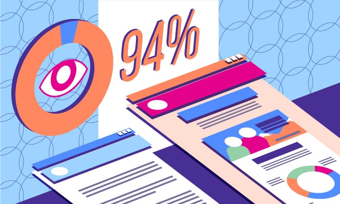
Infographics use imagery and visual assets to communicate a specific message. Check out these noteworthy stats to learn more about the effectiveness of using infographics in your online marketing strategy.
- 90% of the information we process is visual.
- 65% of people learn better when looking at imagery.
- Only 1% of the sensory information that our brain processes actually sticks; infographics fall into this 1% category.
- People’s desire to read through content increases by a mind-boggling 80% when it includes the use of graphics and images.
- A person is likely to follow directions 323% better when reading through instructions that contain images when compared to those that don’t have illustrations.
- Your website’s traffic can be increased by 12% simply because you publish an infographic.
- Nearly half of all marketers agree infographics have the highest engagement rates out of all forms of content.
- Compared to all other forms of content, infographics garner three times the shares.
- Nearly two-thirds of all marketers are already using visuals, like infographics, within their social media marketing campaigns.
Your Guide to the Creative Process of Infographic Design
Creative marketing strategies are needed to ensure your infographics achieve their fullest potential. Creating an amazing infographic doesn’t happen overnight. It takes a ton of research and a lot of design talent, as well as extensive promotion, to reach your target audience and achieve a strong ROI (return on investment) and ROE (return on engagement).
The investment you’ll make into creating effective infographics is going to be high. An enormous amount of thought, creativeness, and strategic planning are needed from start to finish to create and promote a good infographic.
All brands can benefit from putting together an infographic marketing strategy. Here at IGW, we excel in creating infographics and we’ve put together a helpful go-to guide that breaks down the creative process of infographic design.
Steps to Take Before You Start the Infographic Design Process
Creative content marketing strategies for infographics start well before you head to the design table. The first step you need to take is to pinpoint your target audience. Ideally, you’ll use a customer persona to identify who you are speaking to.
Don’t have a customer persona? Then stop. Drop whatever it is that you’re doing and create one. Your customer persona is the cornerstone of all marketing strategies. It outlines who your most ideal customers are, their challenges, and how your brand can specifically meet their needs. All of this information will help you come up with ideas throughout the infographic process.
Now it’s time to evaluate your content and ideas for your infographic. Does it speak to your target audience? Does it solve one of their needs? Can they even benefit from the message you’re wanting to share?
Once your message is carefully refined and you’re 150% sure it’s relevant to your audience, you’ll start conducting research. You’ll pull the content for the infographic from your research. It’s imperative that all facts and data referenced come from credible sources. Sources like Wikipedia and quotes from group forums are not deemed as credible and should not be used.
Forbes is a great site to pull information from, but you still need to verify the sources that Forbes uses. Much of the time, you’ll end up discovering that a link they use to attribute a source is broken. If this is the case, you won’t want to reference those statistics or data points in your infographic.
Get an infographic built for your company
Create an Outline and First Draft

During the first draft stage, you’ll pick the colors and graphics that you want to use for your beautiful infographic. You’ll also gather all of your visual assets, like logos, images, data for your charts, icons, etc. It’s usually best to create a folder on your computer to house all of these assets; this makes it very simple to tap into them as you’re creating the infographic.
You’ll also want to craft all of your captions and headlines for the infographic. If you’re not a professional content creator, it’s usually wise to outsource the content creation. This person can create an attention-grabbing headline, introduction, conclusion, captions, and any other content that’s going to be included in the infographic. Do keep in mind, though, that the majority of the infographic should be images and graphics, and not words and text.
Choose Fonts and Color Scheme
From here, it’s pretty much copy and paste. You’ll go back and forth between the program you’re using to create the infographic and you’ll copy and paste or upload your assets into the template you’re using. If you’re using custom graphics, you’ll, of course, need to have them created and ready for uploading.
When choosing your colors, keep in mind that those elements are 85% of the reason that your audience will either choose or not choose to make a purchase. Not only do you want those colors to support the message you are sharing, but you also want them to align with your brand’s logo and other marketing materials. You want your audience to look at the infographic without seeing your logo and already know that you are the one who has published it.
Choosing the best color scheme for your infographic might seem simple, but it requires a lot of creative thought and will have a significant impact on your audience’s comprehension of the message you are sharing. To promote optimal comprehension, it’s best to stick with two to four colors. That old saying “less is more” definitely applies when it comes to colors in infographics.
You’ll want to use one or two main colors and one to two complementary colors. Pick clear and bold colors for your main colors and subtle and warm for your complementary. If you think it needs a bit more color, pick various shades of the colors you’re already using. Most importantly, don’t be afraid to add lots of white space. In fact, white space around all elements should be a top priority. You want each graphic to demonstrate a certain part of the overall message you are sharing, and you don’t want those graphics to blend together.
Designing an effective infographic also requires a special selection of fonts. These are the infographic elements that are going to make your break the readability and understanding of your message. With the right selection of infographic fonts, you’ll increase the ambiance within the design. Fonts also help inject personality into the message you’re sharing. A poor choice of fonts will make your infographic appear cluttered and it obscures the point you’re trying to make.
If you have time, set aside a few hours to try out different fonts and see which ones most effectively augment the creativity you’re going after.
Decide on Orientation and Visual Hierarchy
Both the wireframe and orientation of the infographic will play major roles in how well it performs in regards to audience engagement. Most websites utilize a vertical orientation, meaning you should probably steer clear of horizontal. As far as your visual hierarchy, you’ll need to ensure the infographic highlights various focal points. Most importantly, that these focal points flow well from one to the next and that they complement the rest of the infographic’s design elements.
Design the Infographic
Now that you have your fonts, assets, color scheme, research, and visual hierarchy in place, you can now create the infographic. If you’re not a design specialist, don’t try to be. Outsourcing the infographic creation process is a smart move to make for those who don’t have the skill set, time, AND resources needed to create one.
If preferred, you can leave the entire design process in the hands of the infographic design agency. The agency will have a team of specialists who can complete research, select color schemes, design graphic assets, and take care of all aspects involved in creating your infographic. You simply tell them the message you’re wanting to share and sit back and relax while you watch your infographic become a reality.
Make sure to outsource to an agency that specializes in interactive and animation content. Both of these elements will bring life to the infographic and are known to increase engagement rates.
Get an infographic built for your company
From start to finish, it takes about four to eight weeks to create an infographic. The first several days focus on refining the message you want to share. From there, you’ll begin the research and source verification process.
Then it’s off to the design table once you choose fonts and color schemes along with orientation and visual hierarchy preferences. If you have a professional design agency creating an infographic for you, this is when you’ll receive a rough draft of the content piece and you’ll be able to provide lots of feedback regarding the content and design. Don’t hold back from asking for as many changes as you like. Once you submit your feedback, you’ll only have one to two more rounds of edits before the infographic goes into the full final design phase.
Create a Distribution and Promotional Plan

Create a landing page for each infographic you publish. This way, no matter the platforms you promote it on, your audience will be directed to your site to view it. Promoting the infographic on every social media platform that you have a profile on is highly recommended.
You can also reach out to bloggers, news outlets, journalists, influencers, and other websites to see if they will promote your infographic. Make sure to tell them they can include the infographic in their own articles as long as they link back to its landing page on your site; this is a great way to garner valuable backlinks for your infographic, which goes a long way in boosting the SEO value of the final piece.
Determine Your ROI and ROE Goals
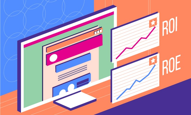
Most marketers create infographics to educate their audiences on a particular topic in the hopes of generating leads through increased traffic to their websites. This means there needs to be analytics in place that track how much traffic is coming to the site because of the infographic; this is why having a landing page devoted solely to the infographic is of such importance.
The Takeaway
Here at IGW, we excel in creating effective infographics that engage the audience. Tell us the message you’re wanting to share and the ROI and ROE objectives you have in mind, and we’ll handle the rest. Are you ready to start engaging your audience with infographic services?
Use Infographics To Increase Inbound Leads Today
Sources
http://news.mit.edu/2014/in-the-blink-of-an-eye-0116
http://www.phschool.com/eteach/social_studies/2003_05/essay.html
http://www.quepublishing.com/articles/article.aspx?p=1916418&seqNum=2
http://www.saurageresearch.com/visualizing-video-infographics/
https://link.springer.com/article/10.1007%2FBF02765184
http://www.demandgenreport.com/industry-topics/rich-media/2906-the-power-of-visual-content-infographic.html
https://venngage.com/blog/visual-content-marketing-statistics/
https://www.quicksprout.com/2015/03/20/the-ultimate-guide-to-creating-visually-appealing-content/
https://www.nngroup.com/articles/photos-as-web-content/
https://www.socialmediaexaminer.com/wp-content/uploads/2016/05/SocialMediaMarketingIndustryReport2016.pdf


