There’s a massive amount of considerable thought that goes into creating effective infographics that garner high engagement. Anyone can create an infographic thanks to the abundance of design tools available on the internet, but impressive infographics that increase conversions and attract quality backlinks require strategic graphic design and take several weeks to create. Our focus at Infographic World is to provide infographic design services that go above and beyond for your brand so that they can have the biggest, most positive impact on your company. The content research alone that goes into creating infographics can sometimes take two weeks or longer.
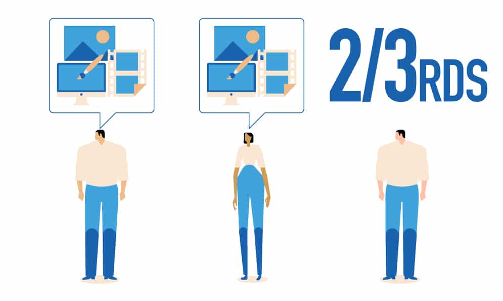
If you have yet to use imagery in your marketing efforts, you’re far behind your competition. Two-thirds of all marketers already use visuals of some sort. This can include anything from photos, custom graphics, videos, and more. With infographics, you’re given a unique way to integrate photos, animations, graphics, and text in a single medium which is proven to be effective in content marketing and social media. Did you know when compared to other forms of content that infographics are shared three times more?
Why are infographics shared so much? Because a good infographic is easy to follow. You can take a complex concept or idea and simplify your message through the use of imagery. Knowing that infographics build backlinks, boost your SEO value, and increase sales, however, doesn’t amount to anything unless you’re actually publishing them.
Ultimate Guide for Creating Effective Infographics
Are you ready to start leveraging infographics? If so, it’s imperative to understand that there’s a ton of knowledge and a special skill set needed to create custom infographics that reach and engage your target audience. Here at IGW, we know a thing or two about infographic creation. In fact, we’re an industry leader and we’ve put together a helpful go-to guide you can lean on that makes infographic creation as simple as possible.
Identify Your Target Audience

You might have a killer idea in mind for a great infographic, but you must make sure that topic appeals to your audience. Infographics that garner the most traction and engagement, and most importantly, virality, are going to be ones that are specifically relevant to your intended audience.
For example, imagine you want to do an infographic on college degree programs. If your goal is to promote a nursing program, then you would want to design an infographic on various types of nursing degrees. This ensures your infographic lands in front of the target audience. If you do one on nursing degrees, educational degrees, and science degrees, you’re going to attract a much wider audience that most likely doesn’t have a need to do business with your brand.
Focus on a Complex Topic But Keep It Simple
Infographics are great at simplifying complex messages, but they are meant to be very easy to understand and follow. Through the use of graphics, designs, and other forms of imagery, you can easily create an amazing infographic and keep your audience from going into information overload. Instead of cramming a ton of words and ideas into your infographic, try to keep it as light as possible on text.
Marketers are often confused when it comes to infographics. They think they have to pack a ton of information in a small space. In all actuality, though, infographics can be as long as you like. Even if you’re printing the infographic, you can create a print version.
Infographics that are concise and to the point tend to perform the best because they secure high rates of engagement. If your audience looks at the infographic and is confused as to where it starts and how to follow it, then you’ll need to head back to the design table and do some rearranging. You also don’t want the audience having to zoom in and in just so they can see tiny details that you have included. An infographic maker or design specialist will help ensure all content and graphics are pleasing to the eye and easy to view.
You’re going to be surrounded with information after you’re finished researching content for the infographic design. By keeping all of the information organized, you can easily pinpoint the most important pieces that should be included in the final product. If it’s something that’s common sense or general knowledge, don’t include it. You want to leave your audience in awe by revealing information they don’t know in a beautiful inforgraphic. More importantly, with information that is backed by credible sources, which takes us to our next tip for creating effective infographics.
Only Use Credible Sources
An infographic’s effectiveness is largely based on the sources you use. You can’t use Wikipedia as a source. The point of an infographic is to showcase yourself as a thought leader, also known as an industry expert. If you’re quoting and referencing information that comes from entities that aren’t credible, you are minimizing the credibility of your own brand.
Thanks to the internet, there are tons of places to turn to for credible information. Sites like Forbes and CNBC are excellent places to start, but even when sourcing from them, you’ll want to check their sources. If you can’t verify a source, don’t use it.
It’ll be extremely helpful if you can use quotes from other industry leaders and experts. In the infographic itself, you’ll either need to include the source or add a superscript number with a corresponding footnote that states the source. Your audience deserves true and factual information, and it’s your responsibility to provide it to them.
You don’t want your audience having to spend their time checking your sources. You should be known as a brand that always provides data and information from credible sources without them having to double check.
Stay On Topic
Another crucial element to creating effective infographics is making sure you stay on topic. Simplicity is at the heart of effective infographics, and if you veer away from the core topic, you are going to end up confusing the audience. Instead of creating an infographic that is spotted here and there with stats, data, and figures, you’ll need to create a storyline for it to follow. This streamlines the entire piece and helps the audience follow along with the message you are sharing.
Also, make sure there is a single, focused point that you are trying to make and that all data correlates with that single point. Take for example you are doing an infographic on the importance of wearing steel-toed boots in a factory setting. Instead of listing 7 benefits of wearing those boots in a factory setting, a more singular topic would be 7 ways wearing steel-toed boots in a factory setting increases worker safety.
Be as Visual as Possible
Humans respond better to visuals and they enjoy being able to see information presented in a visual format. The more visual you can be in an infographic, the better. If there is any way possible to convey a statement in a visual manner, then you should. A lot of infographics end up being more text than visuals. When this happens, it’s not really an infographic. It’s essentially an article with a few images and graphics.
Promotion Is a Big Deal
You’ll also need to keep in mind that in order to create infographics that convert, you must put a lot of time into promoting them. As with any type of marketing campaign, the sooner you start promoting it, the better.
You can have the best infographic in the world that includes awesome graphics and tons of interesting information and stats, but if you don’t promote it, it’s not going to go viral.
Promotion of your infographic should never be an afterthought or viewed as a second priority. It should be at the forefront of your marketing efforts. You want it to be shared as much as possible, meaning you must ensure there are easy-to-use social sharing buttons for the audience to click on. You’ll also need to embed a sharing code within it, making it simple for your audience to include the infographic within their own blog posts; this is a great way to acquire backlinks, which will do wonders for boosting the SEO value of the infographic.
Don’t assume your audience is going to share the infographic — ASK THEM TO SHARE IT! Both in the introduction and conclusion of the infographic, include a CTA that asks the audience to share the infographic on social media as well as their own sites.
Be Careful of Losing Readability
There’s a lot of resizing that takes place when creating an infographic. Your design specialist will often make the infographic very large during the design process. Once the developer gets his or her hands on it, the infographic is usually downsized. During the transition, the readability gets lost and you end up with an infographic that is difficult to read and follow. A professional infographic production agency will understand how to maintain readability and quality of the graphic.
If the infographic features different font sizes — and it most likely will — you must make sure the smallest font is still big enough to be easily read without having to zoom in too much. The infographic also needs to be responsive, meaning it should automatically adjust itself in terms of sizing according to the device it is being viewed on. Once again, this is something that a professional infographic creation company will excel in.
Choose a Reasonable Length and Size
Yes, infographics are supposed to be big, and most times, they are fairly long. There does come a point, though, when an infographic can be too big. If you cross this line, you’ll end up losing your audience. Most importantly, they will click away before they ever hit the share button.
The point of an infographic is to make it quick and easy for your audience to learn a lot of information. If they feel like they’re experiencing information overload, they’re sure to remember this and won’t likely return to view any other infographics you publish in the future. A length of about 8,000 pixels is long enough. After 8,000 pixels, you begin losing your audience’s attention.
You must also consider the download size of the infographic. If it exceeds 1.5 MB, your audience may experience a slow download time.
Use Lots of White Space
The easiest way to ensure the visual elements don’t blend together on the infographic is to include lots of white space around each one. You want the images to be clearly distinguishable, with each image making a different statement.
The infographic featured below created by IGW for Charles Schwab does an excellent job at using lots of white space to enhance the viewer’s experience.
A design specialist will have the knowledge and skill set that it requires to balance text, images, and white space to create an effective infographic.
Create an Awesome Headline
Lastly, when publishing the infographic, you’ll need to include an awesome headline. In fact, the headline will be the primary reason people click or don’t click on your infographic. It’s imperative to create a landing page for each infographic you publish and then optimize those pages for SEO purposes. For example: In addition to a title and headline for the page, you’ll need to create an SEO title and a relevant permalink.
The Takeaway
Creating an infographic is going to take a lot of time and work. A quick online search reveals all types of websites stating you can create one in less than an hour, but these are going to be lacking in quality. The research itself for the content you include the infographic will likely take several days to several weeks.
Here at IGW, we specialize in visual marketing and we have a team of design and content specialists ready to create an effective infographic that shares your brand’s message and reaches your target audience.
Use Infographics To Increase Inbound Leads Today
Source
https://blog.hubspot.com/marketing/visual-content-marketing-strategy


