See How Infographic Marketing Can Skyrocket Your SEO Today
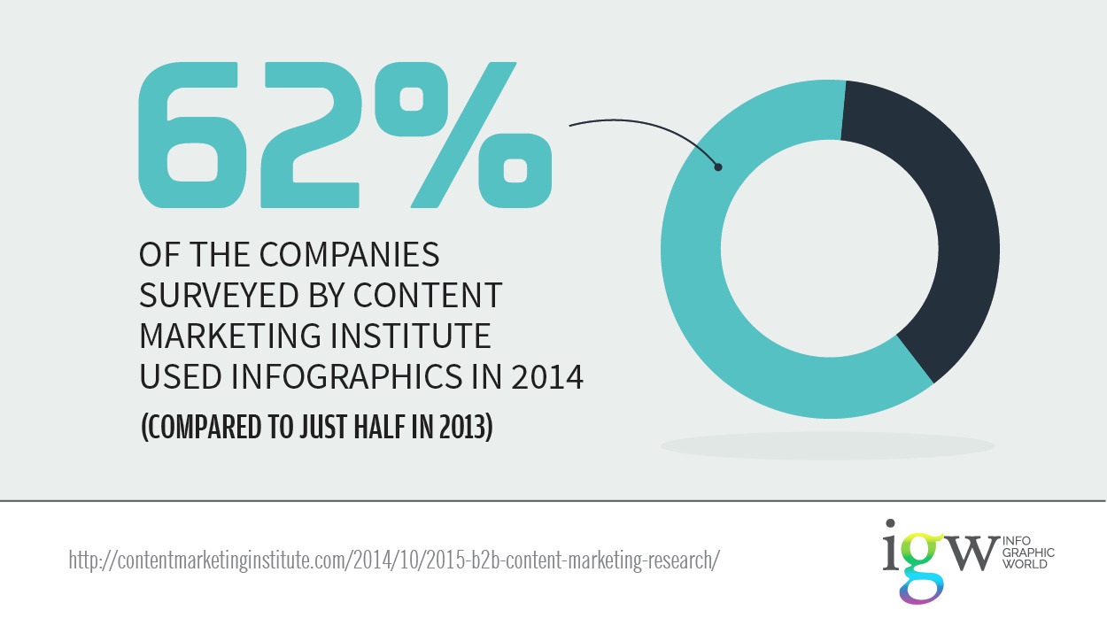
Infographics are the fastest growing digital marketing strategy in the U.S. 62% of companies surveyed by Content Marketing Institute used infographics in 2014 (compared to just half in 2013), with another 26% expressing intentions of using infographics for the first time in 2015.
There is no question infographics are definitely not going away anytime soon. But, whether you’re a marketing expert or just someone who enjoys (or hates) infographics, there is a significant question very much in debate: do infographics still work?
Now, we’re a company who specializes in creating, researching, and designing infographics, so obviously we’re a bit biased when it comes to answering that question. Should you use infographics? Before we answer that officially, let’s take a look at some data so we can arrive at an answer driven by facts rather than our personal feelings.
Some Infographics are Unbearable, Let Alone Ineffective
Many naysayers have grown sick of infographics, and for good reason. Not all infographics are worth the virtual paper they’re not printed on. That isn’t just graphic design elitism talking, it’s scientific fact. MIT conducted an extensive study on the way the human brain processes visual information, particularly the way an image appears in a user’s peripheral vision and how the brain includes that information into a “mongrel” image. It revealed that many poorly designed infographics are virtually useless to the human brain, regardless of how interesting the subject matter might seem.
Takeaway: Your infographic needs to be designed well in order to be effective. Skimp on design, and you’ll potentially waste every ounce of effort in producing an infographic.
Color Works
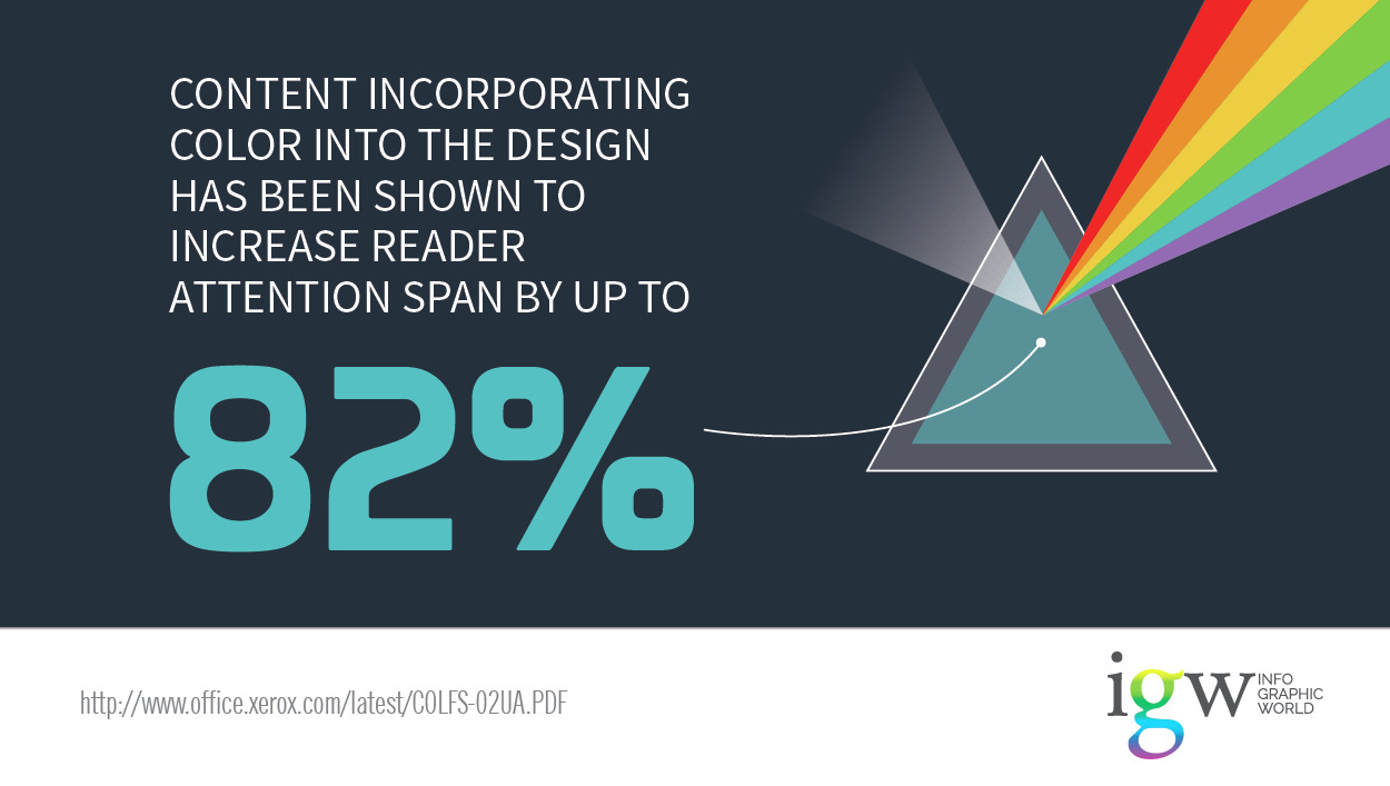
Now let’s take a look at the other side of the effectiveness spectrum. One of the most powerful aspects of an infographic is the way it can use color to help readers (viewers, really) understand information more quickly and efficiently. It is a proven scientific fact: color helps us process information. It actually helps us read better. Content incorporating color into the design has been shown to increase reader attention span by up to 82%. But readers don’t just pay attention longer (which, in and of itself, is a huge hurdle to leap in today’s culture), they also comprehend what they’re reading up to 73% better with the assistance of color.
Bring pictures and symbols into the scenario, and the learning efficiency goes through the roof. A study of prescription users showed that people are 25 times more likely to maintain high adherence to instructions when the prescription labels include pictograms compared to patients receiving text-only instructions. With that in mind, infographics have the potential to save lives. (You may have to squint really hard to see it like that, but you can if you try.)
Keep in mind, most brands are publishing information that isn’t life-or-death important. Whatever message you may craft, you’ll be hard pressed to come up with a topic as urgent to your audience as taking prescription medication in the right method and dosage. When readers approach most copy (the copy their health doesn’t rely on) they read an average of 20% of the text they see. The attention-gaining power of infographics is absolutely critical to delivering your message to an audience that demands something more interesting than text.
The point is, infographics are, by nature, designed to communicate more effectively and efficiently than text alone or even text and images functioning as different components. Infographics combine graphics and copy (and loads of relevant, interesting information) in a perfect marriage of communication elements . . . when they are executed properly. A poorly done infographic is a nuisance, but an infographic professionally designed by an authority in the industry can get a message—your message—to an audience virtually instantaneously.
Case in Point
Don’t think infographics can deliver the traction your brand needs? Here’s an example from January 2015 that hit all the right notes. Building on the exploding popularity of the NFL and one of the most exciting matchups of the season, an infographic created for Dallas Cowboys made an instant impression, yielding over 35,000 Facebook likes, over 4,100 shares, 236 tweets, and 479 Google+ shares. It helped fuel the excitement heading into the playoff game while channeling that excitement into traffic on the Cowboys home page.
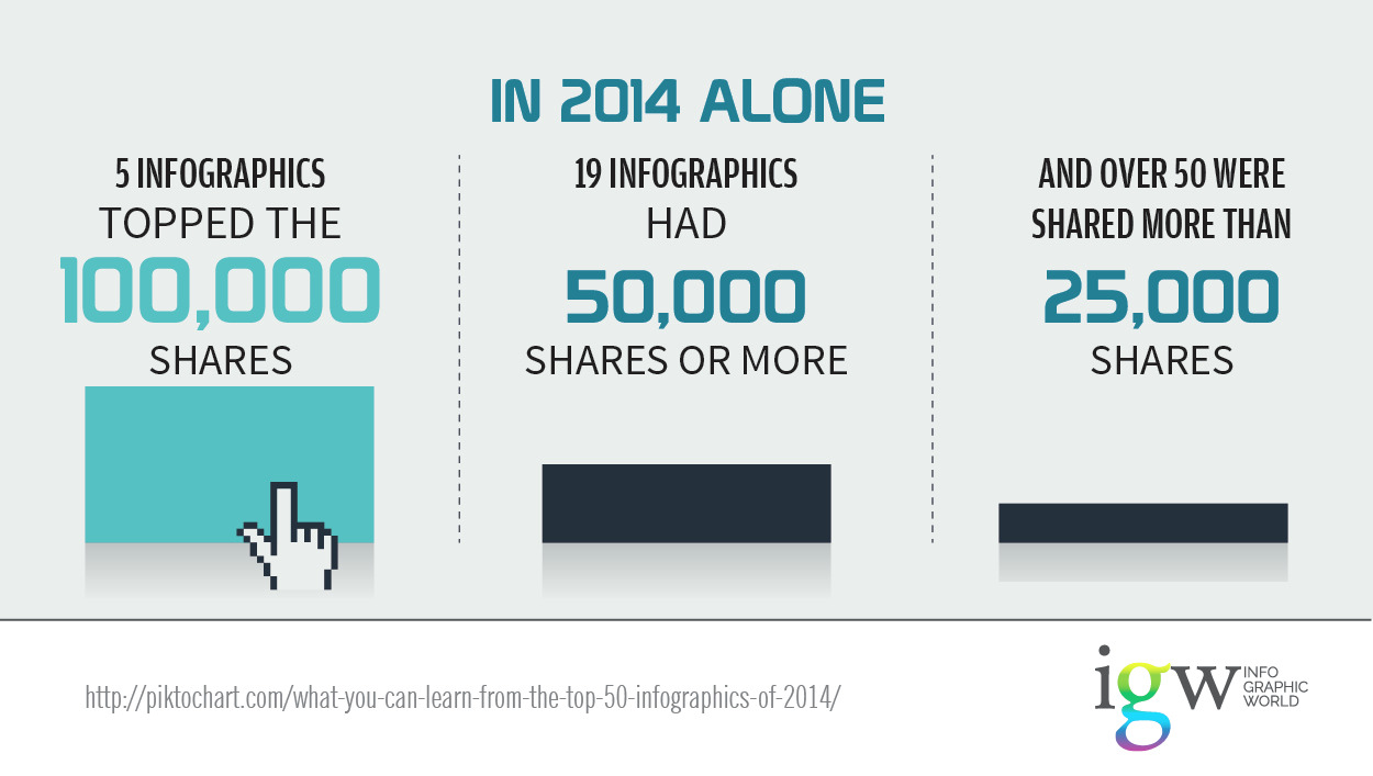
The facts show that infographics can still work as a powerful tool for generating massive amounts of interest in a very quick period of time. They have the potential, when done right, to trigger significant engagement and capture the attention of hundreds of thousands of people. In 2014 alone, 5 infographics topped the 100,000 share plateau—that’s not views, that’s shares. Nineteen infographics had 50,000 shares or more, and over fifty were shared more than 25,000 times. When you consider the possibilities and the value of the exposure an infographic can generate, you start to realize how critical (and relatively minuscule) the initial investment is.
The Answer
So, do we think you should use infographics? Not necessarily. Infographics should be used responsibly. If you’re willing to make the investment of considerable time, research, and expert professionals, the answer is a resounding yes.
—————–
To find out what’s an infographic and more, you can check out our infographic examples.
Got an Infographic Project You Want to Discuss?
Let’s Talk




Leave a Comment