


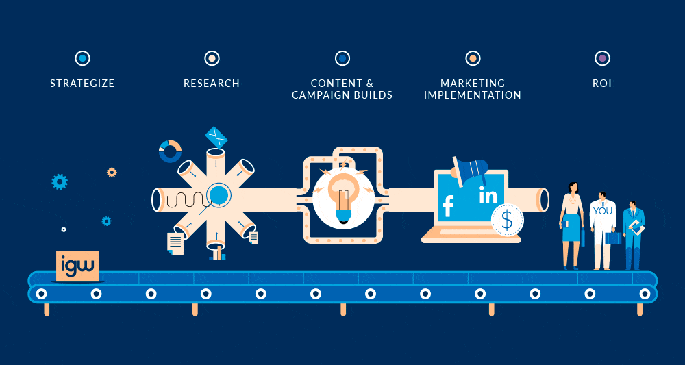
What started as an infographic company, also known as an infographic design agency, grew into a full-service visual marketing agency. We fuse together the science of visual learning and marketing to help you accomplish your marketing & sales goals. Need to improve your organic search rankings? Increase conversion rates? Get those social media ads performing better? Whatever your goals are, we’re here to craft a custom strategy for you that leverages the power of visual learning to help you beat your competition. Need help implementing on the marketing front? We’ve you covered there too.
With our roots as an infographic design company, our world-class creative team of experts specialize in all things visual and are your go-to experts for all creative marketing assets. Check out our portfolio to see examples of our work.
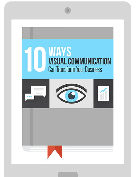
Infographics Help Engage your Audience
We help your brand speak visually to your customers. Our design process is unique as is your brand’s story. We simplify complex content to make it memorable and drives results. We don’t design good infographics; we design great infographics. Get in touch with a member of our team to learn how we can help your business! Tell your story with an infographic today!