Get More Interviews with a custom Infographic Resume from our world-class partner
Move over boring, white, text-only resume. There’s a new sheriff in town, and it’s the infographic resume. These stunning, informative graphics are fun to read, and do a much better job of capturing the viewer’s interest. If you’re looking for a way to boost your job search or wow potential clients, here are some awesome samples of how you can turn your outdated, traditional resume into a powerful marketing machine.
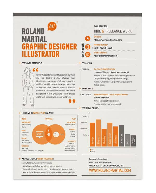
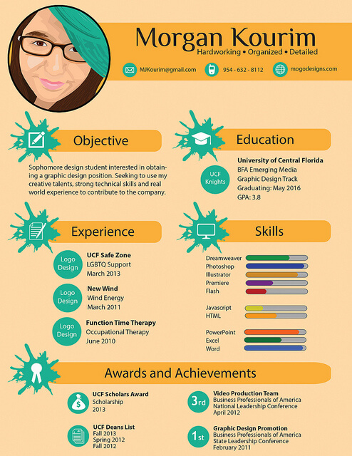
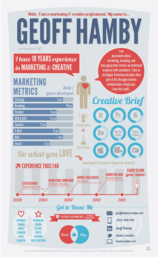
A great example of a simple infographic resume, this design would work for any industry. It includes all the basics that you would find in a traditional CV, and the layout is simple to follow. Also, the color scheme is both easy on the eyes, and attention grabbing.
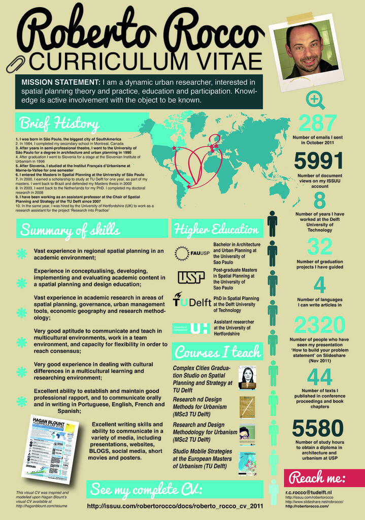
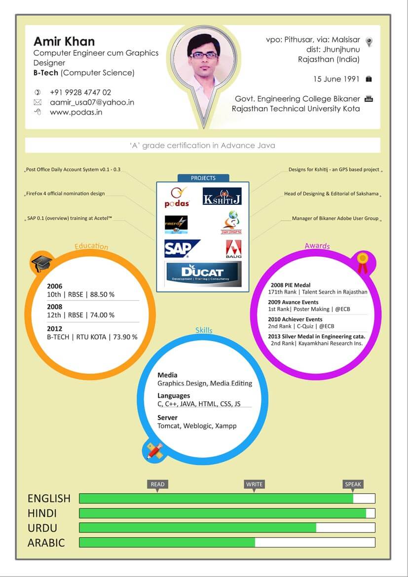
Fancy fonts paired with crisp colors makes for a memorable graphic. This one is creative, and captures the basic elements of an infographic, with a focus on the numbers and stats. Adding a personal picture brings the piece to life, and gives readers a comprehensive view of the applicant.
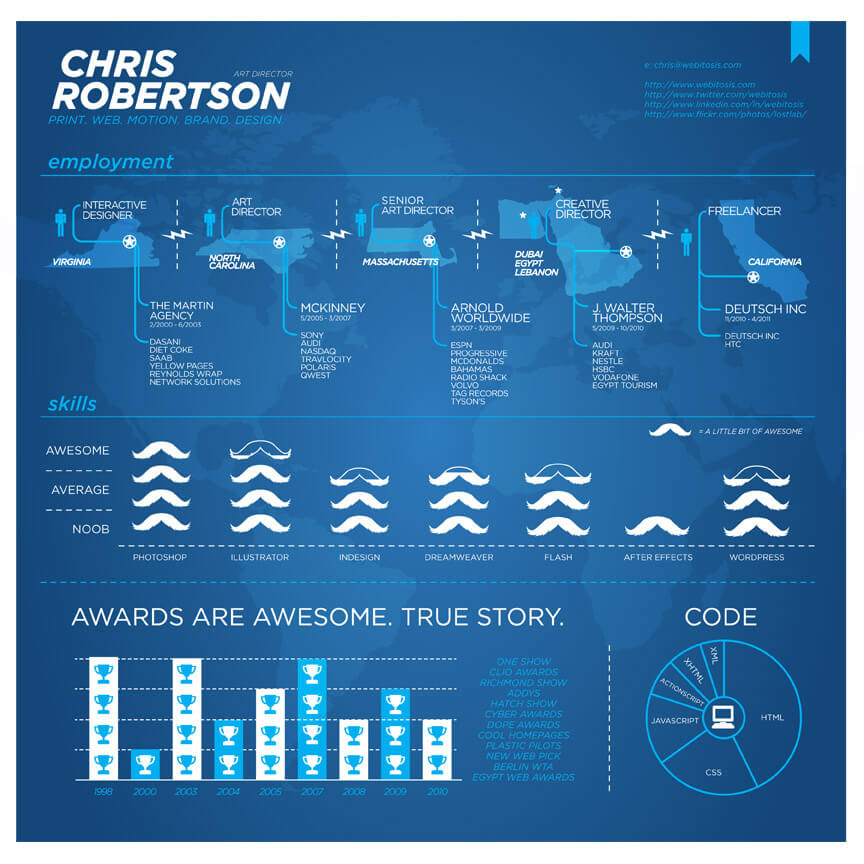
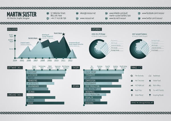
This resume screams power and authority, primarily because of the color. It’s not too dark, but just deep enough to give the piece an authentic feel. The designer uses powerful text and minimum graphics, and each section is intriguing enough to hold your interest.
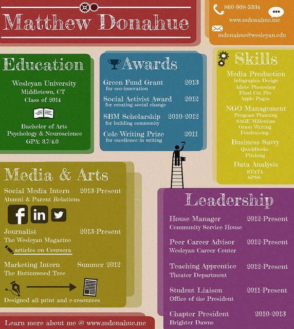
Who says infographic resumes have to be all about the stats? What makes this piece interesting is that it’s colorful, vibrant, and yet simple. Hiring managers who may not be as accepting of nontraditional resumes could view this as a safe alternative. The shadows behind each color block gives the graphic depth, but doesn’t take away from the information that readers need to focus on.
This could easily be considered a must-follow template for any designer’s infographic resume. It has a personality of its own, yet it covers all the basics that you expect to find in a CV. Bursting with creativity, it’s not too over the top, and offers a principal layout that anyone could follow.
Even if you’re not a designer, this one is simple to put together, and yet distinct enough to impress a hiring manager. It’s informative, and covers all the main points. The graphics are minimal, and the information is presented in a clear and coherent manner; a good example of how the slightest application of visual elements can enhance any document.
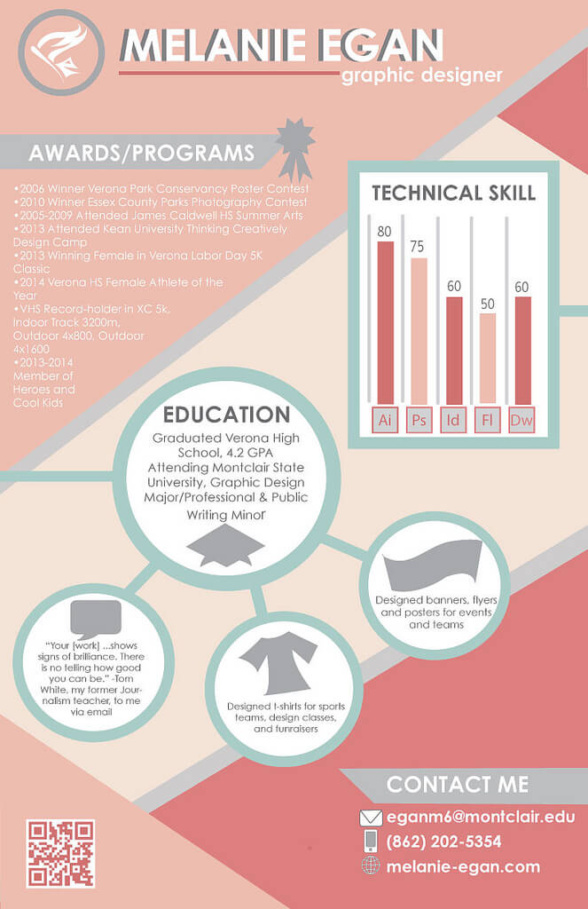
This resume has a feminine feel and a custom look. It’s an engaging piece with clear focus and direction. Each section flows together, making it easy to visually move from one area to the other and get a well-rounded account of the applicant’s skills and accomplishments.
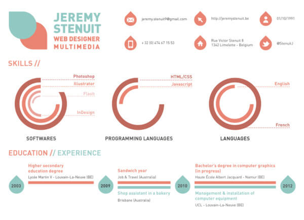
With a crisp, minimalist feel, this infographic resume is both descriptive and alluring. By adding icons in the header section and going with an all white background, the image feels more like a web page than a document. It’s clearly a piece that was well planned and beautifully executed.
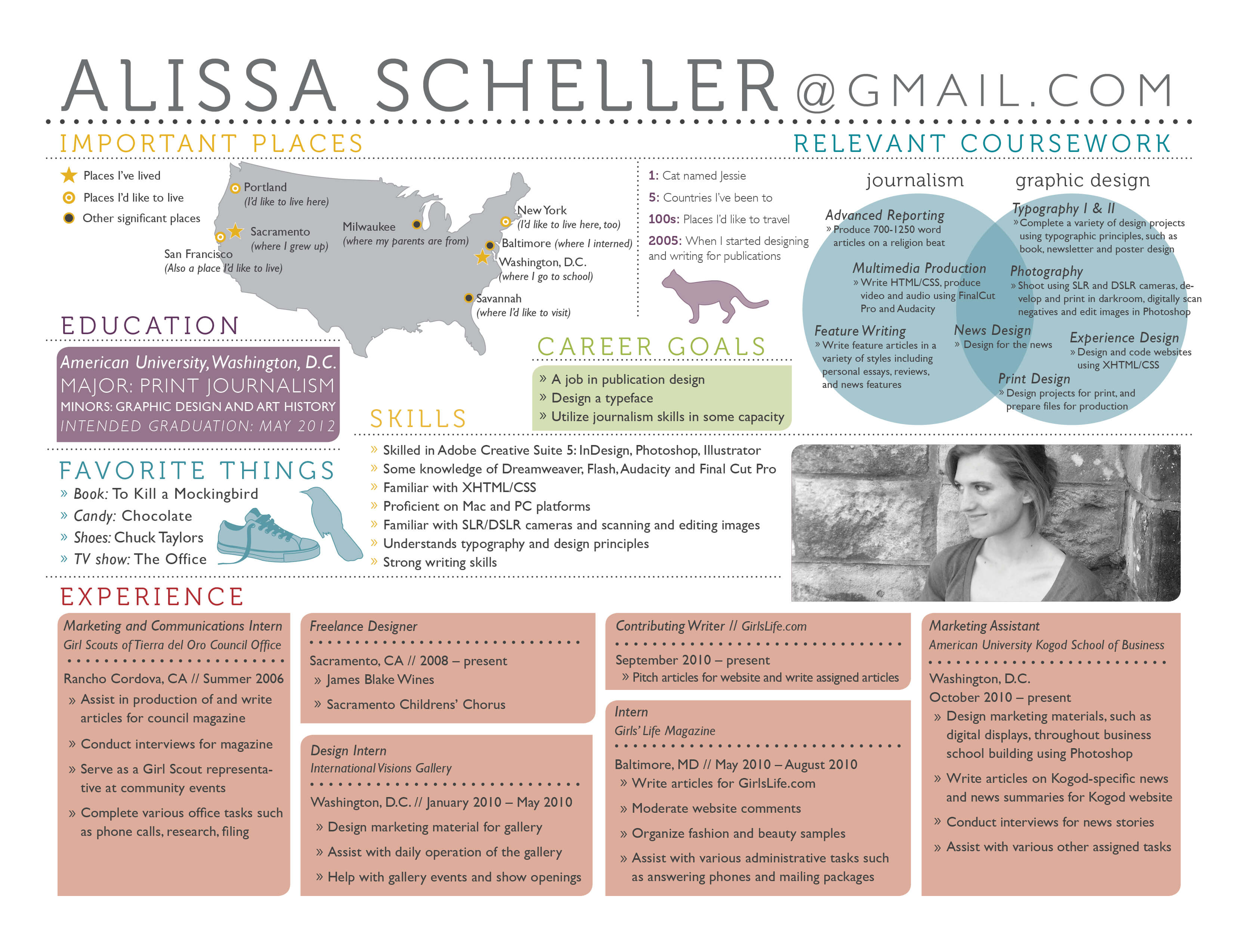
This graphic has a lot going on, but the layout is focused and elegant. The white background helps to minimize the clutter, and the pastel colors contribute an airy, fresh appearance. The picture gives it the professional touch, and adds to the value of the text; an example of what a professional infographic resume should look like.
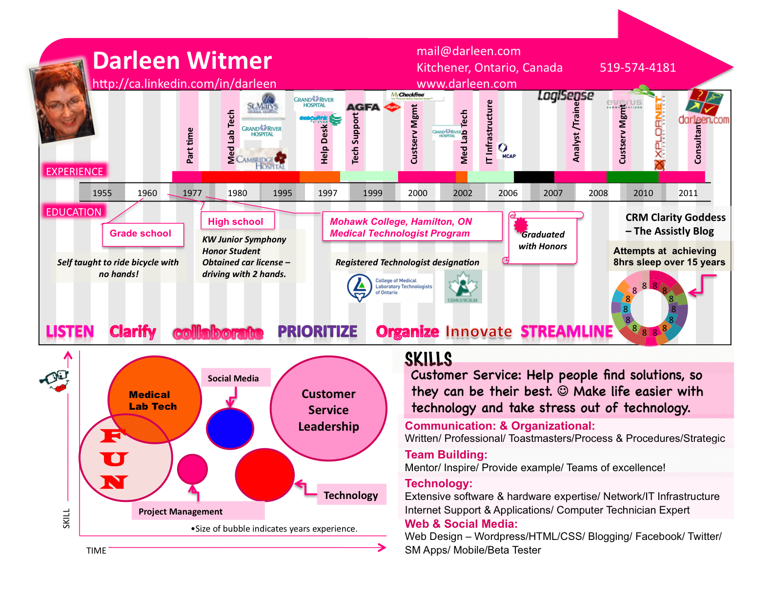
Your infographic resume should be a reflection of your personality, and that’s exactly what we find with this piece. It’s quirky and playful, but includes all of the details that employers would need to make a hiring decision. The bright colors aren’t too overwhelming, but instead add to the uniqueness of the graphic. The owner’s picture also fits the vibe of the piece.
Highly Creative and Energizing
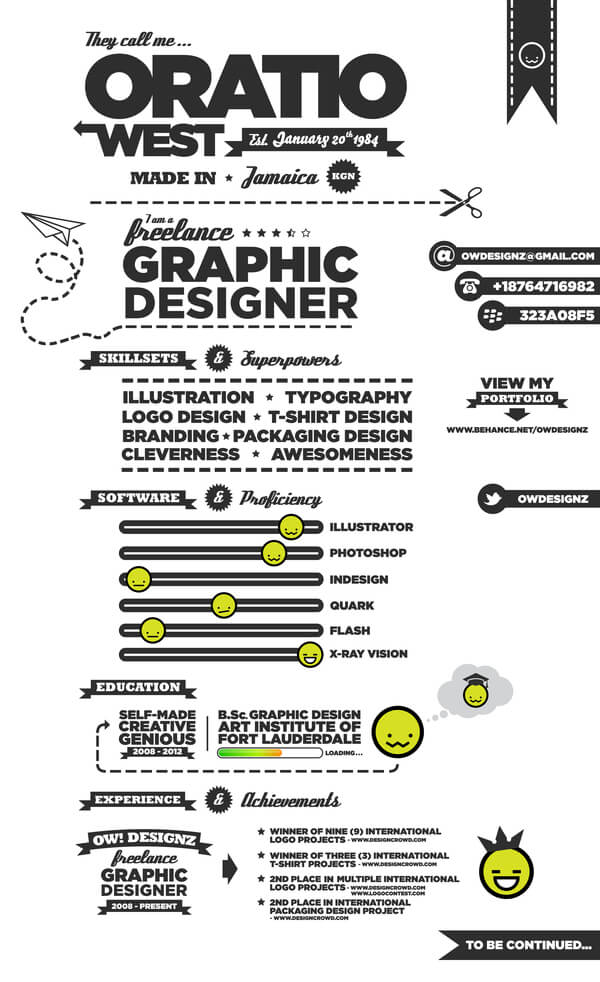
Full of energy and creativity, this infographic resume gets two thumbs up. The content is well written, and displays the owner’s entertaining personality. It contains beautiful typography, and a simple white background that allows each element to stand out; perfect resume to show off your design capabilities.
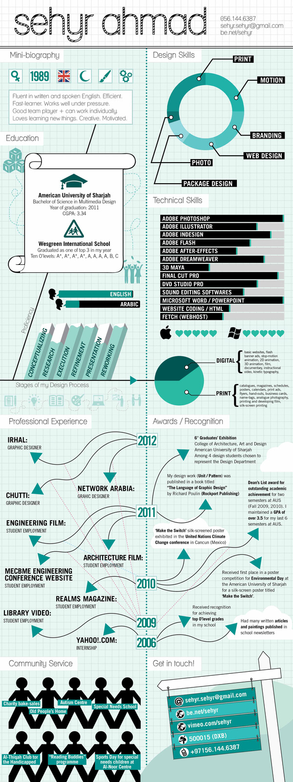
The designer for this piece successfully implemented the classic infographic appeal into a resume. It contains all the traditional infographic elements including graphs and stats, and gives a detailed account of the owner’s background. It has an attractive color scheme, and the images aren’t too overpowering; an excellent sample of how to take turn a typical CV into a conventional infographic.
This playful piece speaks volumes about its owner. It has an interesting mix of fonts, and a pleasant color palette. Highly informative and professional, it emphasizes the important details of the applicant’s capabilities, and it’s’ obvious that design is his strong point. Any client or hiring manager would find this one hard to pass up.
The content of an infographic resume is just as important as the images. This example shows that it’s possible to scale down the images to ramp up on the details. It’s a simple graphic that packs a powerful punch, as readers are presented with a well packaged account of the owners experience and skills. This would work for any industry, and would be particularly suiting for a corporate position.
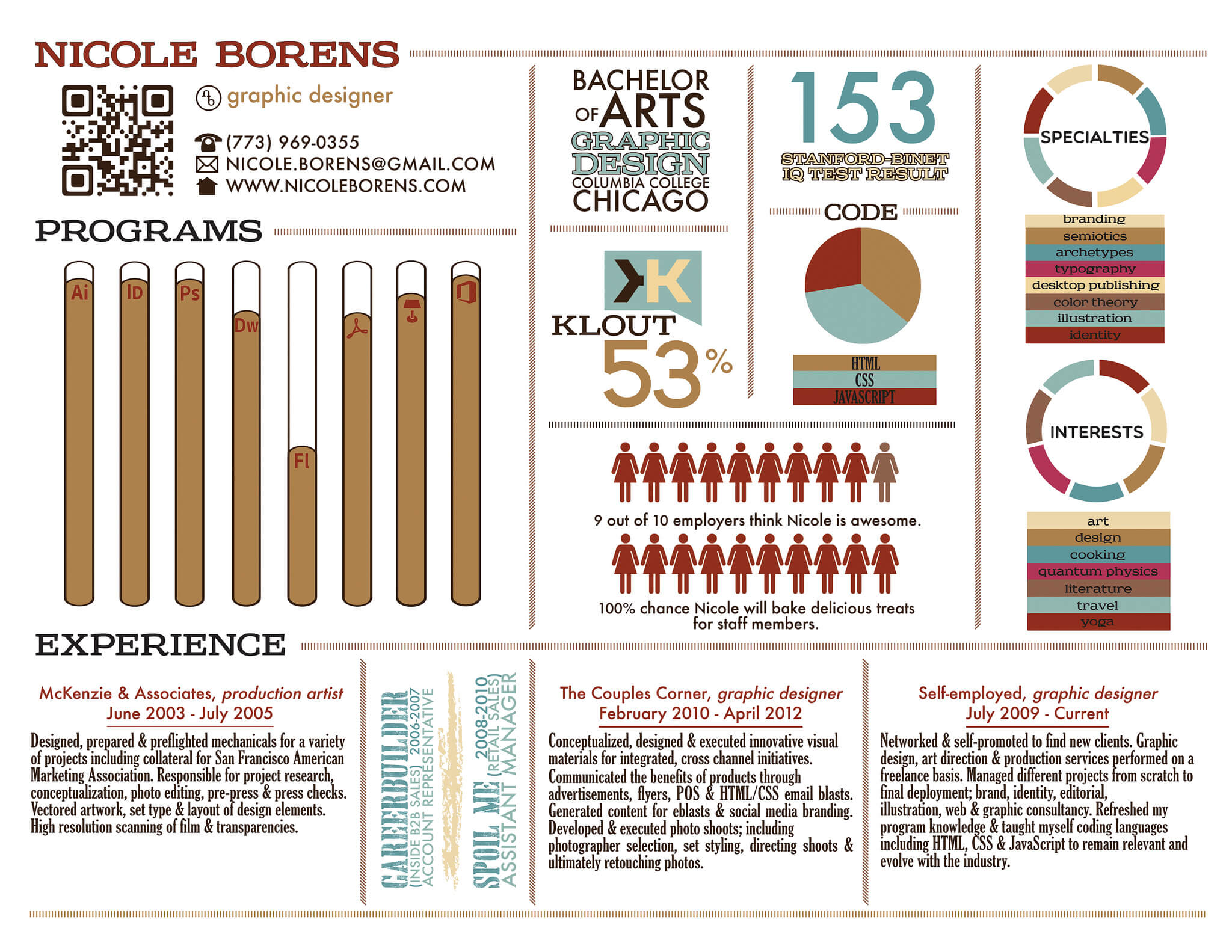
We saved the best for last. This piece embodies the definition of an infographic resume. It’s interesting to read, fun to look at, and gives a detailed account of the owners design experience. The colors blend well together, and clearly show that the designer put time and effort into the flow and feel of the document.
These are just a few examples of how you can transform your resume into an attractive piece of art. Still don’t believe that this will enhance your job search? Try it out, and be sure to come back and leave a comment after you land that dream job 🙂
Got an Infographic Project You Want to Discuss?
Let’s Talk
Get More Interviews with a custom Infographic Resume from our world-class partner





Leave a Comment