Nowadays, it isn’t enough for companies to have a great product or service. The success or failure of a company often hinges on the ability to engage and entertain their audiences. Interactive infographics allow you to accomplish these and many other goals. When used strategically, interactive infographics can serve as some of the most powerful content marketing tools that you have at your disposal.
Definition of Interactive Content
As the name implies, interactive content requires some sort of user input or interaction from the user. Interactive content is mostly visual or includes some type of graphic element. In the case of interactive infographics, the content itself often consists of a single illustration, chart or diagram.
Blog posts are an effective component of any content marketing campaign. However, you can increase their value considerably by adding an interactive element to them. Pair a garden-variety blog post with a quiz, for example, and you can greatly increase engagement with your readers.
Adding even just a bit of interactivity to your content can push it over the edge and increase its chances of going viral. Many internet users today need to have some level of engagement with the content that they access, and passive content often doesn’t cut it. This is why video marketing works so well. Although many types of content can be engaging initially, they can’t always hold the audience’s attention for long periods of time.
Interactive content is especially useful when trying to market a brand or product to a mass audience. By its very nature, interactive content engages the user and almost demands that they take action. When faced with this type of content, users will have to choose between responding to it and moving on. And if the brand or product being marketed is something they are even remotely interested in, there is a good chance that they will choose to engage.
For digital marketers, interactive content is a great way to enhance the focus of a marketing campaign. Because users are given the opportunity to opt-in or opt-out immediately, they can make a decision at a moment’s notice. This enables marketers to focus their efforts on leads that have a good chance of providing results and spend less time on dead-end prospects.
One other important characteristic of interactive content is that it is evergreen. Unlike many other types of content that have a relatively short shelf life, interactive content is more likely to remain engaging long after it was published. This means that you can generally count on most of your interactive content to continue to provide value for a long time to come.
What Are Infographics?
Infographics have been ubiquitous communications tools almost from the time they appeared in the first decade of the millennium. Initially popular in graphic design circles, they soon became widely used in business and education. Even today, you will see infographics used in classrooms and workplaces, and all over the internet.
Infographics are graphic elements that combine images, illustrations or charts in various combinations. They also contain text that provides information on a particular topic, although the text content is usually minimal to keep the information simple and easy to understand.
Infographics are often used for the following purposes:
- Providing a quick topic overview
- Explaining complex procedures or processes
- Presenting survey data or research findings
- Summarizing long reports or blog posts
- Building links
- Comparing and contrasting different options
- Improving search engine rankings
- Raising awareness about certain causes
The illustration or image is the most prominent part of the infographic, and oftentimes, the most important. The main visual element is what initially grabs the viewer’s attention, so it should be as striking and as engaging as possible. At the same time, the graphic should quickly and clearly communicate the intended information.
The primary purpose of an infographic is to communicate complex messages so that viewers can understand them more easily. Infographics essentially serve as visual representations of the information that the content creator wants to communicate. Although they are usually extensions of content contained in a blog post or an article, infographics can just as easily stand on their own and convey a self-contained idea or message.
What Are Interactive Infographics?
Interactive infographics expand on the usefulness of standard infographics by adding an element of interactivity. In most cases, users will be required to click through different sections or pages of the infographic to get access to more information.
The simple act of clicking on the infographic helps keep users interested and engaged. They are also able to get to the specific bits of information they need.
Why Use Interactive Infographics?
Interactive infographics are especially useful if you have plenty of data or information that you want to share, but you want to present it in a way that won’t bore your audience. They are also useful for expanding on a story, keeping users engaged when they would otherwise tune out.
One of the best things about interactive infographics is that they encourage users to explore the content further. Data sets, statistics, and even stories don’t always hold the attention of a reader. But adding an engaging interactive infographic might provide enough incentive to keep them glued to the page.
Because infographics are expected to attract readers and hold their attention, they should be as unique and creative as possible. But the visuals should do more than just engage and excite readers. They should also help audiences understand the message behind the flashy graphics. The most effective interactive infographics achieve all these goals.
Qualities of Good Infographics
Good interactive infographics don’t have to be complicated. In fact, some of the most effective infographics are case studies in simplicity and minimalism. But there are also complex and detail-heavy infographics that seemingly do an excellent job of connecting with the target audience. So what goes into a great interactive infographic?
You will find that the most effective infographics have a few qualities in common. They are always based on an interesting or compelling subject, and they have an appealing and eye-catching design. They also tend to have a degree of interactivity that enhances the content rather than detracts from it.
There are many ways by which you can incorporate these qualities into your own infographics – we’ve listed several in the next section. The most important thing to remember is that the infographic should serve the content and the needs of the target audience above all else. They should be designed in a way that is appropriate or relevant to the message being presented, and structured in a way that appeals to your audience and makes them eager to follow along.
Tips for Developing Interactive Infographics That Really Connect
Here are some suggestions on how you can develop your own effective interactive infographics.
Interactive or Not?
First of all, you should determine whether or not you actually need your infographic to be interactive. Not all content that works as infographics will necessarily benefit from being interactive.
Think about how you want the final infographic to come out and how you want your audience to react to it. If you find yourself struggling to inject some interactivity just for the sake of it, you might be better off delivering your message via a static infographic.
Plan Your Placement
Think about where you will be hosting your content. Even before you begin working on your infographic, you should have an idea of where it will ultimately end up. In most cases, you will probably want your infographic to be included in a blog post or featured in a dedicated microsite.
A website, landing page or blog that gets a healthy amount of traffic is always a good choice for maximum exposure. Embedding your infographic into a high-traffic page will help ensure that a good number of people will see it. It can also boost the traffic to your website, given the appeal of infographics among many internet users.
Of course, you may want your infographic to stand out independently of your other content, in which case a unique microsite might be the better option. A dedicated microsite is also a good option for hosting your infographic if you are developing a new website to replace one that you aren’t satisfied with.
Base Your Infographic on Valuable Data
Interactive infographics are most effective when they are based on meaningful and relevant data that has value to the audience. Whether static or interactive, the value of infographics is dependent on the information they are presenting. It is therefore important to gather and organize valuable information before you even begin developing the visual elements.
Infographics should be just as credible as any other content that you present on your pages. Make sure to use only trustworthy and reliable sources, and try to collect as much relevant information as you can.
It is also a good idea to think about how you want to convey your message to your audience. Should you go for a more formal approach? Or is a lighthearted and fun graphic better suited to your needs? Tailoring your approach to suit your audience and the subject matter will make your infographic more likely to appeal to that audience.
Here’s a tip for gathering data for your infographic: try to focus on a single main subject and use supporting data to put your message across. Trying to pack in several points will just muddle your message and leave your audience confused. If there is other information that you must absolutely share, consider creating a separate infographic for it.
Develop a Story
Many of the best infographics combine data and information with a compelling story. A well-designed visual can make even the most boring data more palatable. But a good story can make your content even more memorable.
Try to center your infographic on a story or feature a story as the main theme. Whether you are trying to promote a specific product or service, or educating your audience on a particular issue, delivering your message in a story format is a great way to get them engaged and to take action.
Tailor Your Visuals to Your Audience
After you have sifted through mounds of information and developed a story, you can begin working on the star of the show: the infographic. When preparing your visuals, think about what your audience may need in terms of interactivity and design. Depending on your audience, certain design elements may be more – or less – appealing.
Once you have decided on an approach, try to maintain the same style and tone throughout the infographic. Campaigns targeting professionals may require infographics with a more business-like and organized design.
If you are targeting a younger audience, you may get a more favorable response with a livelier and more vibrant design with minimal text. In general, you will want to include interactivity features that mimic the target audience’s browsing habits and preferences.
If your interactive infographic is intended for a product launch, it is often a good idea to include elements that are associated with your brand. This will help tie in your infographic with your existing campaign and increase awareness of your brand as well.
Set Up a Reveal
Don’t give up all your information at once. Interactive infographics are supposed to prod your audience along, teasing your readers with bits of information along the way. If you give up all the goods at once, you risk losing out on a valuable opportunity for longer-term engagement.
One effective way to lead your audience along toward the eventual payoff is to set up clicks or rollovers that reveal additional bits of information. Doing this will pique your audience’s curiosity and encourage them to explore the infographic further.
Segmenting your information into chunks that are revealed via a direct action will also allow readers to skip sections that are irrelevant or less interesting to them. This also results in a more personalized experience that won’t make users inclined to stop viewing the infographic entirely.
Add Scrolling or Multi-Page Capabilities
Scrolling or pagination features are also useful tools for enhancing interactivity. These actions are especially effective if they trigger a transition or cause an animated segment to play. Giving them a sort of visual cue or reward will make them eager to move along and finish what they set out to do.
Getting your readers to initiate actions helps them move through the story in a way that is comfortable for them. They will then feel a more profound sense of engagement and be less likely to lose interest. You can even combine scrolling features with simple narratives, which adds even more value to the content as it improves the story flow of the infographic.
Alternatively, you can go for a multi-page approach that requires users to click through the content instead of scroll through it. This gives them even more control over how the story progresses, allowing them to absorb each new piece of information before moving forward.
Proofread
By now you should have a pretty impressive looking infographic before you. But don’t pat yourself on the back just yet. Go over every detail carefully and make sure that your spelling, grammar and organization are on point. Proofreading and editing are just as essential to the process as any other stage, and they can make or break your infographic.
If possible, work on something else while you let the infographic simmer for a few days. Come back to it with a fresh perspective and see if there are any glaring errors or omissions. If you absolutely must get the infographic published as soon as possible, you can have a colleague give it a thorough once-over. Having someone go over your work with a fresh set of eyes will enable you to pick out problems that you may have missed the first time around.
Look for Bugs
An interactive infographic needs even closer scrutiny than your average infographic because of its interactive nature. You will want to make sure that any scrolling or pagination features perform smoothly, with no hassle to the user.
Try to test the infographic on as many different devices as possible. Some graphics may perform smoothly on a computer but may hang up on a mobile device. Make sure to check for speed as well as functionality. An infographic that loads slowly or hangs disrupts the flow and turns off audiences quicker than anything else. If it happens often enough, your readers’ next click might just be away from your website.
Spread the Word
Finally, get the word out about your brand-new interactive infographic. All that time and effort you put in won’t amount to much if no one sees the fruits of your hard work, so plan on spending a considerable amount of time promoting your infographic.
You can enlist the aid of other people in your industry to promote your content. Influential bloggers and news sites in your niche are potentially valuable resources, so plan on making some connections if you haven’t done so already. Make it easier for them to host your content by sending them a concise but comprehensive summary of your content, along with a high-resolution copy of your infographic. This will make them more likely to share your content and give them ideas on how to present it.
Don’t just rely on others to do the promotions for you. Spread your infographic around on your social media outlets such as Facebook, Twitter, Instagram, and Pinterest, along with the appropriate hashtags. You can even use paid social media ads and other pay-per-click ad services to drum up interest and drive traffic to your content.
Finally, send your infographic out to relevant web directories and to your email subscribers. Even with all the social media channels available to you, these options can help you generate additional interest in your campaign.
Examples of Effective and Highly Engaging Infographics
Here are some excellent examples of interactive infographics that you can draw inspiration from when developing your own content.
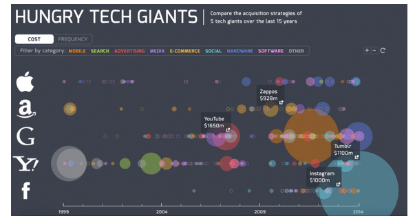
Hungry Tech Giants
This is an especially interesting and informative infographic on how the world’s leading tech giants got to where they are. Published by Simply Business, the graphic shows how acquisitions have largely driven the growth and development of the top companies in the world. The infographic covers the rise of five major firms from 1999 to 2014.
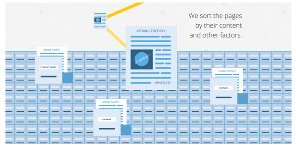
How Search Works: From Algorithms to Answers
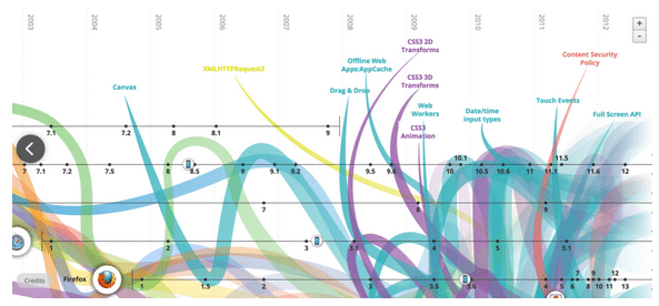
The Evolution of the Web
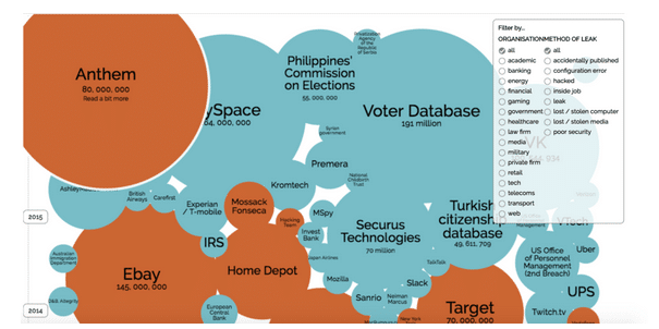
World’s Biggest Data Breaches
The New New York Skyline
This infographic published National Geographic shows how the skyline of New York – once one of the recognizable in the U.S. – has gone through many significant changes over the years. The infographic encourages users to explore the different sections by scrolling through the city and clicking on important landmarks.
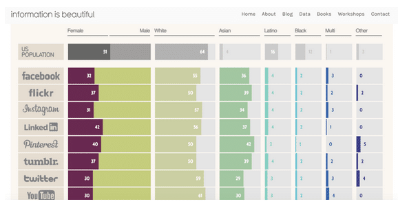
Diversity in Tech: Employee Breakdown of Key Technology Companies
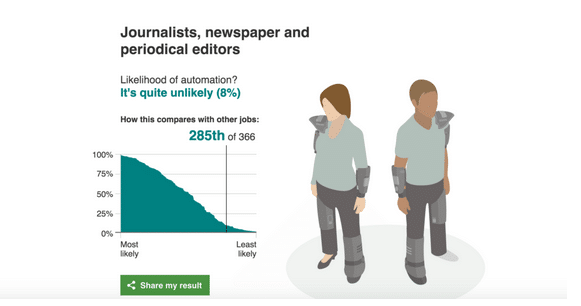
Will a Robot Take your Job?
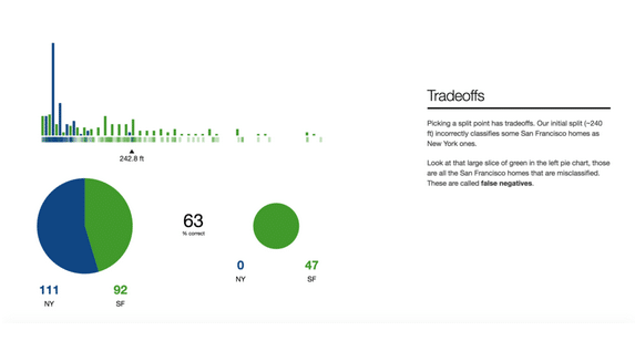
A Visual Introduction to Machine Learning
Vitamin Atlas: An Interactive Guide to Nutrition and the Human Body

45 Words You Should Know About HIV/AIDS
Finally, check out this compelling infographic on the most common myths and misconceptions about HIV and AIDS. Color coding and click-through features make navigation fast and easy.
Conclusion
Interactive content can be very resource-intensive, which makes it a lot more challenging to produce than other types of content. In most cases, it might be better to incorporate interactive infographics gradually as part of a more comprehensive marketing program instead of relying on it exclusively.
Remember, you can still use traditional content to fill in the gaps and perform functions that are beyond the scope of infographics. Regardless of your approach, you will find that interactive infographics will serve as valuable tools for generating leads, boosting traffic, and increasing engagement with your site’s visitors.
Are you ready to engage your audience by delivering entertaining content through interactive infographics? Contact IGW today. We have helped many clients create, publish and promote beautiful interactive infographics.

