What if I told you there was a way to achieve higher conversions with your content marketing?
Well, you can. It starts with data visualization and data storytelling.
Any good story includes lots of visuals and detail. The more detail, the better. And when you enhance your text with visuals, you make the story easier to understand.
Visuals intrigue the audience. They keep them interested and more likely to remember your brand. This is why data viz techniques, combined with data storytelling, is like marketing gold.
Data is all around us, so it only makes sense to leverage it for marketing. Data viz and data storytelling make this possible. Imagine having some really insightful data. But because it’s so heavy, you have no way to communicate it through text. With data viz, you can present extremely complex numbers and stats in an easy to understand manner.
Data viz works because 90% of the information we process is visual. Our brains process visuals in only 13 milliseconds. And because 93% of communication is nonverbal, data viz is of the utmost value.
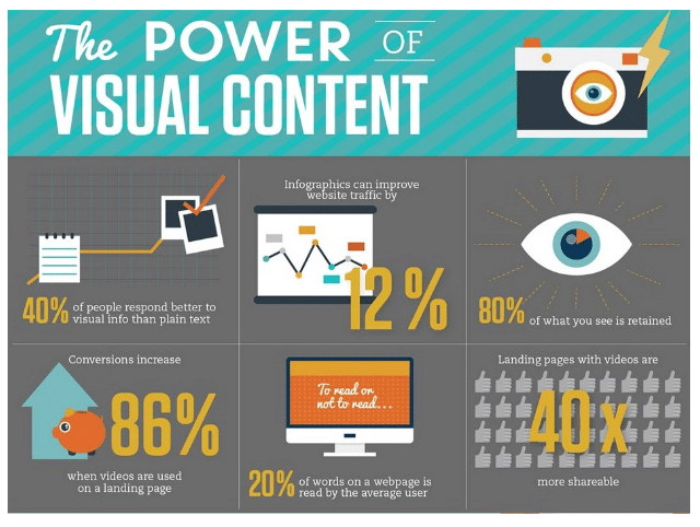
And you know what? Data viz makes your brand more trustworthy, too. A Cornell University 2014 study revealed that 68% of people already believe the information they read is truthful and accurate. When you put a graph or chart next to the information, this percentage increases to 97%.
So let’s get to it and take a closer look at data viz and data storytelling.
(If you’re on the hunt for data viz tools, check out our post on data viz software programs.)
The Benefits of Data Viz and Data Storytelling
Data storytelling is a unique content marketing tactic. Scientific research shows marketers can use the tactic to better communicate with audiences.
Data Provides Meaning and Value
You know effective content marketing requires providing valuable content. After all, if you’re not providing value to your audience, why would they want to read your content? They won’t and they don’t.
Your audience wants content that is useful and relevant. They want content that solves a problem or teaches them something they don’t know. They don’t want to look at a bunch of numbers or lines of text. If they struggle to understand what you’re trying to say, they will turn to another brand for answers.
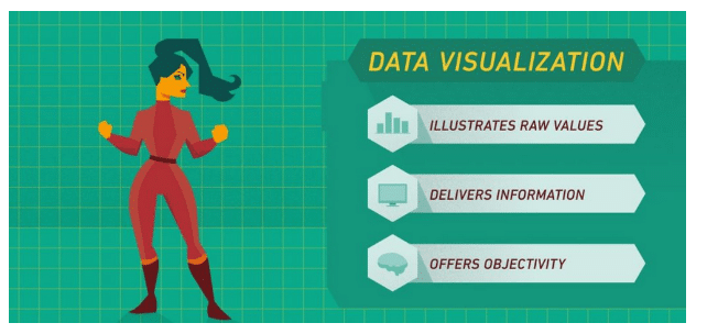
You can have all the data in the world, but if it don’t make sense, your audience won’t care. Data storytelling helps you present data in a way that it tells a story. It connects the dots and gives meaning and context to the data. It allows you to illustrate raw values and deliver precise information, and offers objectivity.
Makes It Easy to Secure PR Coverage
Data viz and data storytelling help you create unique stories.
Take a look around you. Look at your marketing data. Your revenue data. Now take a moment to reflect on all the data you actually have. When you analyze this data, you can create exclusive stories that intrigue your audience. Pair your unparalleled data with visuals, and you’ve hit the jackpot in securing PR coverage. From unexplored topics to putting interesting spins on previously covered topics, you become an industry expert.
Just like your audience, publishers want unique content. Instead of regurgitating content already on the web, it’s time to come up with your own stories. Data storytelling and data viz help you do just that.
Billions of pieces of content are added to the internet every day. This makes it difficult to stand apart from competitors. This is where data viz knocks the ball out of the park.
A single data viz story published by a high-profile publisher can do more for your brand than a year’s worth of blog posts.
Getting publishers to fall in love with your content is pretty simple. After all, they have several reasons to want to publish your content. First, it’s free content for them. Who doesn’t love free, quality content?
Secondly, it gives them dibs on resources they otherwise go without. Even the biggest publishers lack manpower and skills from time to time. This is especially true when it comes to creating visual stories. When you give them an interesting data viz story to publish, it’s a win-win.
Thirdly, publishers want your content because it makes them look good. Whether you’ve created an interactive infographic or a sleek explainer video with lots of visuals, publishers want content that engages the audiences. Data viz paves the way for high engagement. Who wouldn’t want to be the journalist who secures a data viz story that goes viral?
But I don’t have to time to sit around sending pitches all day!
It’s true. Pitching publishers takes a lot of time and work. And only your best pitches provide a strong ROI. You can pitch 100 journalists, but if you’re pitching irrelevant content, you’re wasting your time.
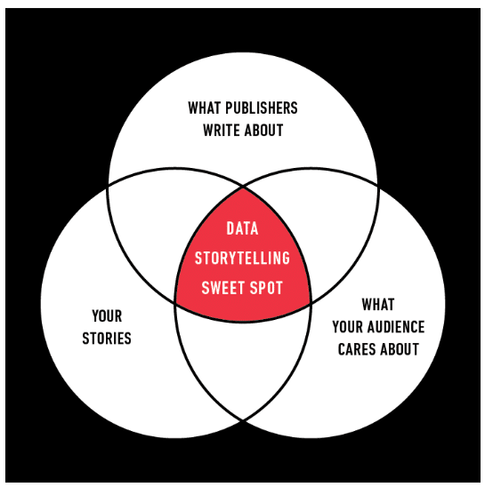
A strategy will help you secure coverage from publishers. Target publishers who are most likely to pick up your story. Ensure your data viz story serves an editorial objective and helps publishers nurture relationships with their audiences.
It should go without saying, but we’ll say it anyway. Target publishers with relevant audiences. What’s the point in getting your content in front of an audience if none of them want what you have?
If you sell HVAC marketing services, getting your content published on major veterinary publications won’t be of much value. Instead, you should target publishers that have large audiences of HVAC professionals. This is how you generate quality leads.
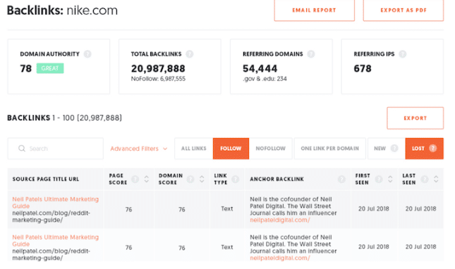
Getting PR coverage from data viz and data storytelling provides another benefit. Every time a publisher picks up your story, you can build a backlink. Backlinks from publishers with high-domain authority do a lot of good for your own domain authority.
Each backlink from major publishers improves your overall SEO ranking. This translates into higher search engine rankings and, more specifically, greater brand awareness.
Picture getting a data viz piece picked up by CNBC, Forbes or Entrepreneur. Talk about ultimate brand awareness and credibility. It’s an automatic boost for your brand’s reputation when you build backlinks through sites like these.
Increases Your Credibility
Let’s talk some more about credibility.
We’ve all been there before. We search online for a product and find one with a great price. The only downside is, it’s from a brand that you’ve never purchased from. You’re not even sure if you’ve ever heard of the brand.
It happens to all of us. There we are with our finger on the purchase button wondering whether to click. If we knew the brand was credible, we’d be much more confident in clicking the purchase button.
Data viz and data storytelling gives you a way to separate the truth from the bullshit. Even if you’re a new brand, you can move your audience to trust you. All you have to do is tell your story with credible data. Put the numbers and facts in a pretty visual and your audience will be much more likely to hit the purchase button.
Let’s pretend you’re an SEO marketing company. A prospective customer is searching your site, considering whether to contact you. The person is also searching some of your competitors. On one of your landing pages, you’re marketing your long tail SEO services and you include the following data visualization example.
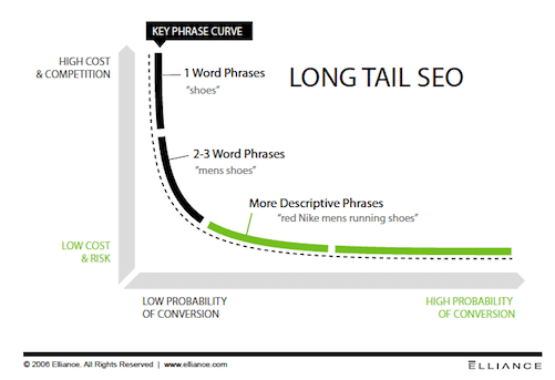
Data viz showcases your expertise. It anchors your message to reality in a visual manner. It shows that you know what you’re talking about and that you’re worth doing business with.
None of your competitors have data viz examples to support their text. Which brand do you think the customer is going to choose?
Data viz showcases your expertise. It anchors your message to reality in a visual manner. It shows that you know what you’re talking about and that you’re worth doing business with.
The Shiznit of Versatility
No doubt about it, coming up with new topics for content is time-consuming. This is particularly true for brands that publish content on a regular basis.
Yet again, this is when data viz and data storytelling become your hero, by providing optimal content versatility.
The easiest way to make the best use of your data viz is to create a digital data storytelling book. You’re going to add to this book on a regular basis.
In your data storytelling book, you’ll have at least 12 sections:
- Annual reports
- Infographics
- Reports
- Articles
- Motion graphics
- White papers
- Interactive infographics
- Brochures
- Case studies
- Microcontent
- Presentations
- Explainer videos
Each time you publish a data viz content piece, put it in the appropriate section of your data storytelling book.
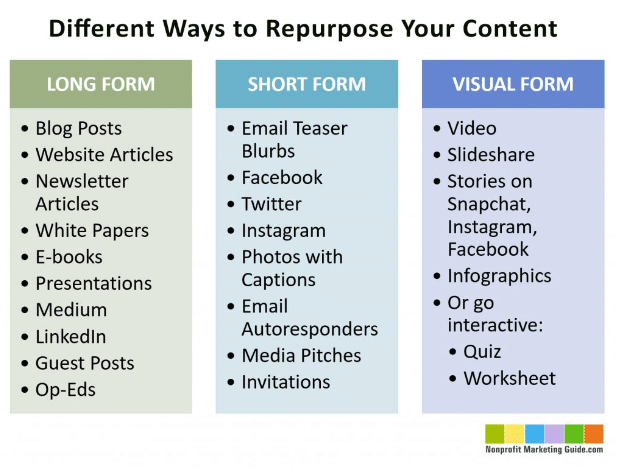
Pull out your book when you need ideas for new content. You can repurpose each data viz into other content formats. For example, you can use the data from a single infographic to create an article, blog post, explainer video, presentation, and many other types of content.
Let’s say you create a content marketing strategy and one of your targets is to publish three new content pieces each week. That means you need 156 pieces of content each year. With only 13 data viz content pieces, you have enough to last you all year as long as you repurpose each of them according to the list above. It’s much easier to come up with 13 topics for data viz pieces than it is to come up with 156 separate topics.
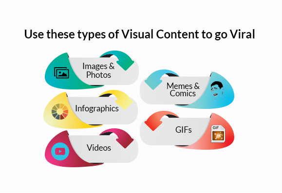
Here’s a nifty visual that outlines even more ways to repurpose your data viz content:
Creating Effective Data Visualizations
Technology has definitely enhanced data viz creation capabilities. We have data viz tools to extract data, analyze data and even create neat little charts. Put some data into Excel and BAM! You can create a graph. But for most anyone without data viz expertise, that’s where data viz ends.
Your data has a story to tell, but data viz tools can’t create the story for you. They can only bring the story to life. It’s the job of the analyst to create the story. That’s why it takes much more than data viz tool defaults and templates to create quality data visualizations.
For now, we’re going to cover five must-know tips for effective data viz.
Give Yourself Some Context
Ask yourself this question: Who is your audience and what do you need them to know? This situational context largely influences how you create effective visuals. You’ll need a buyer persona to get a good understanding of your audience. This persona should outline the likes and dislikes of your audience and their preferred communication channel.
The better you understand your audience, the easier it is to create quality visuals.
Providing yourself context also involves doing a lot of exploratory analysis. You’ll be deeply exploring your data to find a story that will pique the interest of your audience.
Cole Nussbaumer Knaflic, a data viz guru, says that exploratory analysis is “like hunting for pearls in oysters. We might have to open 100 oysters (test 100 different hypotheses or look at the data in 100 different ways) to find perhaps two pearls.”
Once you find your pearls, you can move into explanatory analysis. “When we’re at the point of communicating our analysis to our audience, we really want to be in the explanatory space, meaning you have a specific thing you want to explain, a specific story you want to tell — probably about those two pearls.”
Knaflic goes on to highlight how brands commonly fail with data viz. They think it’s okay to showcase all of their exploratory analysis. They present all 100 oysters. What they should do instead is focus only on the oysters that have pearls.
It’s tempting to show all 100 oysters. Who doesn’t want their audiences to see all of the hard work they put into data viz, right? But it’s a huge mistake when you make your audience open 100 oysters when only two of them have pearls. In fact, it’s a waste of their time. More tragically, you lose their trust.
Choose the Right Visual
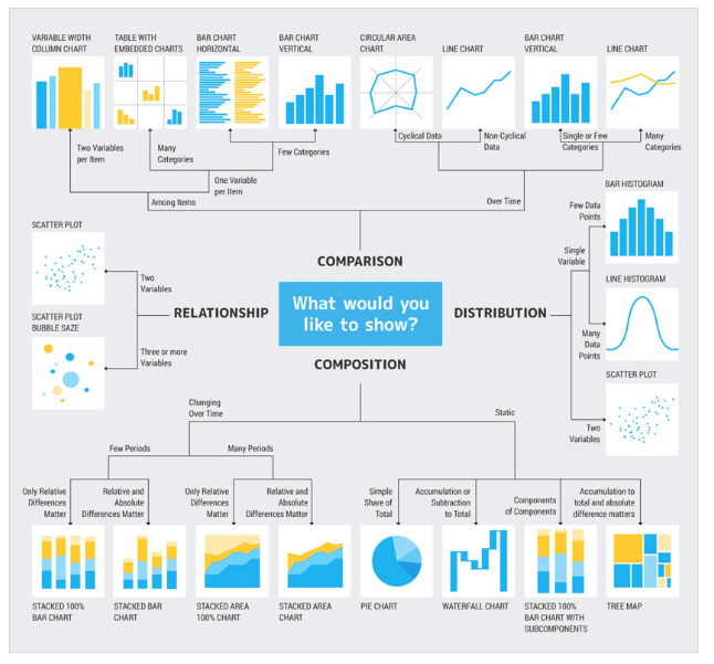
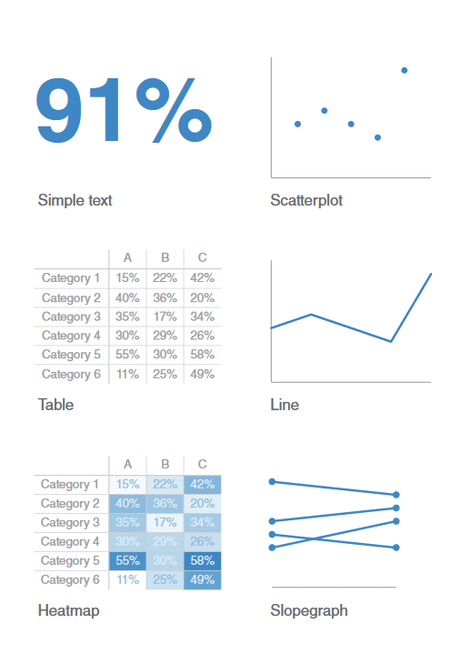
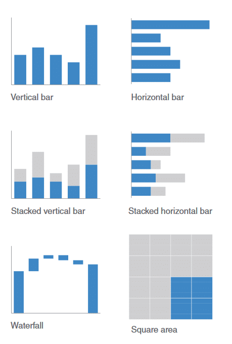
Data viz comes in numerous forms. Check out the visuals below for an understanding of just how many.
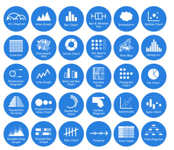
We’re not going to cover all data viz types, but we will discuss a few.
Simple Text
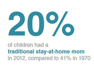
A simple text data viz is perfect when you want to share numbers but have no need to create a graph. Here are a couple of tips to ensure that you create effective simple text:
- Make the main number as prominent as possible.
- Only include a few supporting words (no more than a single sentence).
 Table
Table
If you have more than one or two numbers you want to highlight, consider making a table.
Tables do well at communicating different units of measurement, and they are typically easy to follow. Your audience can use their index fingers while reading across rows and down columns.
However, tables don’t work well in presentations. As you’re verbally making your point, your audience gets lost trying to read the table. Other forms of data viz work better for presentations.
Follow these tips when creating a table:
- Make sure the design fades into the background.
- Let the data take center stage.
- Don’t use heavy borders or shading.
- Use white space to set elements apart and enhance comprehension.
 Graphs
Graphs are extremely visually appealing. Your audience also processes them quickly and easily. A carefully-curated graph communicates a message quicker than a table. The four most common types of graphs are: area, point, bar, and line graphs.
The most important tip to follow when creating a graph is to always ensure you’re using consistent intervals. If the horizontal axis represents years in decades, it must represent decades throughout the whole axis. You can’t skip to yearly intervals after a certain point. If you do, your visual distorts the truth.
Remove the Clutter
Every data viz starts out on a blank page. Every element you add requires cognitive comprehension from the audience. The more elements, the more difficult it becomes to comprehend.
The whole point of data viz is to make a message as easy as possible to understand. With that said, don’t add elements if you don’t need them. If an element doesn’t add informative value, don’t include it.
But what happens when you create a data viz only to discover it doesn’t fully communicate your story? Does this mean you should add more elements? Not necessarily. You may need to remove some and add in others. The goal is to use your audience’s cognitive load to your advantage.
Any time you take in information, you experience cognitive load. Too much information — or too much difficult-to-process information — leads to cognitive overload.
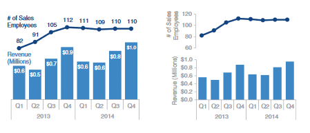
Here’s an example of a bad data viz versus a good one. The first one causes cognitive overload. It has too much clutter and improper use of elements. The second one is much more visually pleasing and easy to comprehend.
Use Gestalt Principles
The Gestalt principles of visual perception play an important role in effective data storytelling. These principles are:
- Proximity
- Similarity
- Enclosure
- Closure
- Continuity
- Connection
Here’s a really helpful article on the Gestalt principles and how they impact data viz. Just as the article explains, the Gestalt principles “are commonly presented along with interesting optical illusions that they can produce, [and] are particularly important when it comes to creating data visualization.”
Focus the Attention of Your Audience
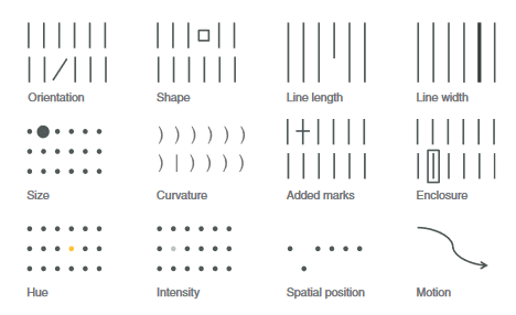
Focusing your audience’s attention requires understanding how they see. It also requires using preattentive attributes to your advantage. These attributes do well at leading your audience through your data viz. You can ensure they look at each element in the order you want them to see them.
Let’s take a look at how color influences your audience’s attention. In the visual below, count how many 3s there are.

See, wasn’t that much easier? You can do the same thing when creating data visualizations.
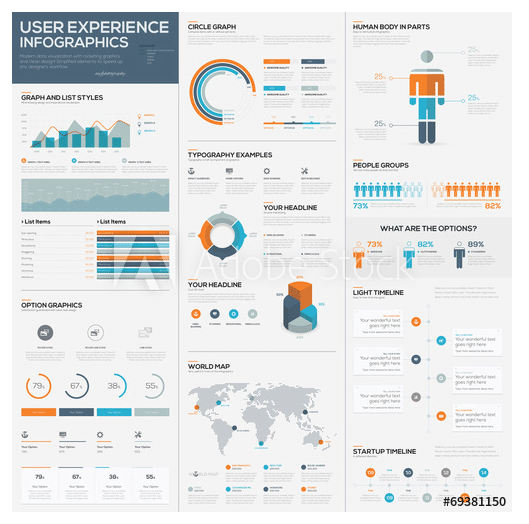
Here’s a data visualization example that showcases various types of preattentive attributes you can use to guide your audience’s attention.
Create Like You’re a Designer
You don’t have to be a graphic designer to create data visualizations. You just have to think and create like you’re one.
The three keys to thinking like a designer are:
- Highlight the important stuff
- Eliminate clutter
- Create a clear hierarchy of information
To highlight the important stuff, use the following tactics to your advantage:
- Bold
- Italics
- Underlining
- CASE and typeface
- Color
- Inversing elements
- Size
To eliminate clutter, follow these tips:
- Understand that not all data is equally important
- If details aren’t needed, simply summarize
- Ask yourself: “If I delete this, would it compromise the integrity of the story?”
There are two core components to creating a clear hierarchy of information: Size and color.
Size almost always captures the attention of your audience before anything else. Next, is color. White space, for instance, does a phenomenal job at guiding an audience through information.
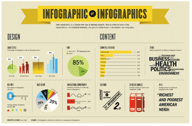
Just because an element isn’t big, though, doesn’t mean it doesn’t help guide the reader. In the following visual, notice how the smallest elements — the tiny dots — guide the reader from one section to the next. Even though they’re the smallest elements, they do a wonderful job at helping the reader flow from one visual to the next.
 Conclusion
To be honest, there is so much more to data viz and data storytelling. What we’ve covered so far is only the tip of the iceberg.
And to be perfectly upfront, data viz that achieves high ROIs usually comes from the hands of professional graphic designers. Thank goodness you know a few of those, right? Contact IGW now for help with all of your data viz and data storytelling needs.


 Table
Table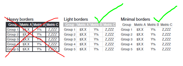 Graphs

 Conclusion