You publish content to increase brand awareness and achieve higher conversions. Did you know fonts matter just as much as the content you publish?
Quality content that engages your audience should always be a top priority. But if the appearance of your marketing content makes it difficult to read, you’ll end up losing your audience’s attention. That’s why marketing and advertising fonts deserve a little more attention than they often get.
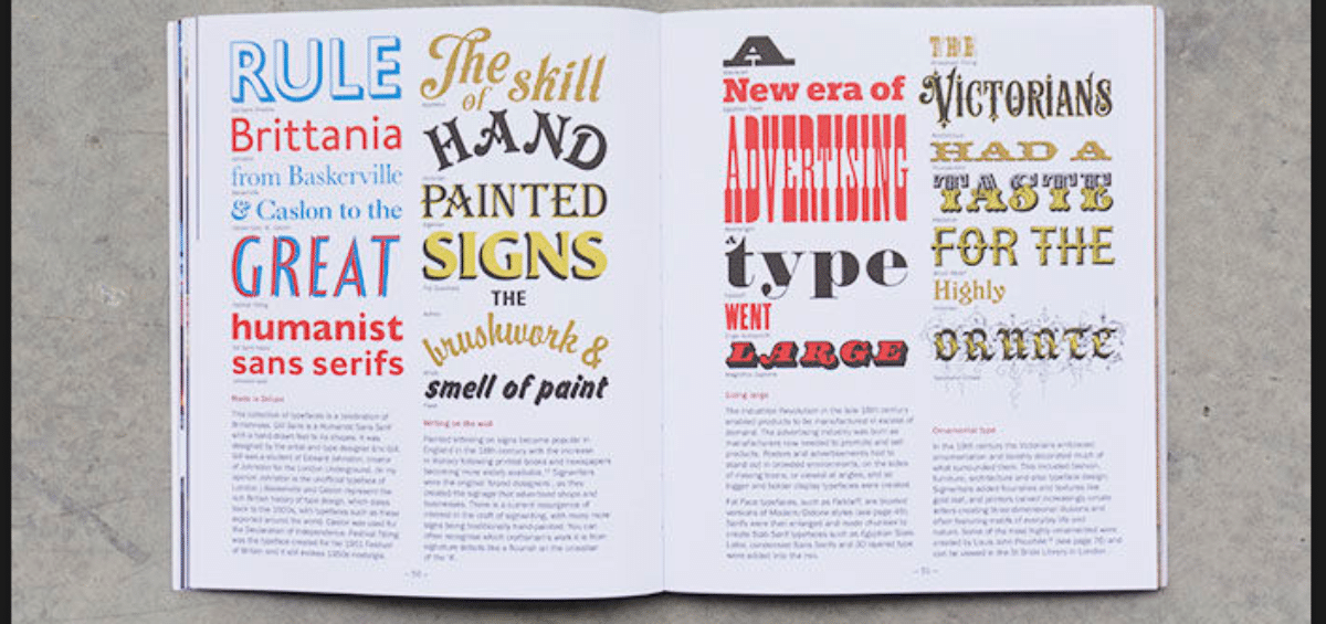
Most marketing tactics use fonts strategically, including traditional print advertisements, news releases, website design, and infographics.
Let’s take a look at why fonts matter in advertising. Out of the two examples below, which one is easier to read?
The example above makes it easy to understand why fonts matter. Even the spacing between the letters influences how your audience feels when they read your content. Let’s take an even closer look at the importance of carefully choosing advertising fonts.
Why Do Fonts Matter?
The font you use affects your audience’s perception of your brand before they ever have a real interaction with your brand. As soon as a person sees your logo, they’ll form an instant idea of how your business behaves.
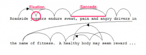
When your audience reads your content, their eyes follow a scanpath. A scanpath is a pattern that comes naturally to humans. Understanding the scanpath makes it possible to enhance the design of your words so your audience can better comprehend your message.
Sentences have saccades (scans) and fixations (pauses). For a typical reader, the scanpath looks something like this:
Usually, your eyes can read about seven to nine letters before they need to pause. The pause is necessary because it ensures you comprehend and process what you read. As you’re scanning a sentence, you don’t visually process the words. Visual processing only takes place during the pause.
If you think fonts don’t impact how your audience feels when they read your content, make sure to check out what Kevin Larson says about the way fonts influence human emotion.
The primary conclusion of the study was that people feel better when they read content that has an easy-to-read font and good reading layout. Those exposed to well-designed layouts have a higher sense of clarity, better cognitive focus, and more efficient mental processes when compared to those exposed to poorly-designed layouts.
Probably the most notable conclusion of the study was that “well-designed reading environments…do make you feel good, causing you to feel inspired and more likely to take action.”
Font Meanings in Marketing
Now we’re going to take a close look at three different font families and their emotional associations. As a marketer, you must choose the right font for your advertising content to move your leads through the sales funnel.
Serif
The serif font family is easily recognizable thanks to the little lines or strokes that extend from each letter. Known for being an older typeface, the serif font family evokes feelings of romance and elegance. If you’re going for a classic or formal font, you can’t go wrong with a font from the serif family.
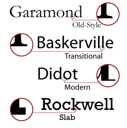
Some of the most popular serif fonts include Times New Roman, Garamond and Georgia. Serif typefaces come in three types: slab serif, humanist and transitional. There are additional serif categories as well like modern and wedge.
Humanist serif fonts are good for printed works like books and articles.
Transitional serif fonts have more contrasting strokes and work well for law and academic writing.
Slab serif fonts give an authoritative feel and serve as an effective advertising font.
Here’s a look at different types of serif fonts.
Sans Serif
Sans serif fonts don’t have the strokes or little lines that serif fonts have. They are considered more modern than serif fonts too. Marketers commonly use sans serif fonts when trying to evoke feelings of cleanliness or friendliness. This font family is also used when trying to signify something as minimal or modern. Because of their simplicity, sans serif fonts are easy for children to read.
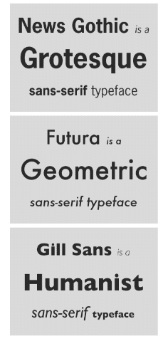
Three of the more popular sans serif fonts include Open Sans, Verdana and Arial, with the latter being what you’re reading right now. This font family is especially beneficial when displaying large groups of text on a web page, such as in posts on a blog. The three primary types of sans serif fonts are geometric, humanist and transitional.
Humanist sans serif fonts work well for small text. Government, education and finance companies often use humanist sans serif fonts like Gill Sans or Whitney.
Because of their strong stroke marks, transitional sans serif fonts work well for tech and transportation writing.
You can achieve an objective and universal appeal when you use a geometric sans serif font like Europa or Future PT. These fonts are particularly beneficial for science and architecture writing.
Here’s a look at three types of sans serif fonts.
Script
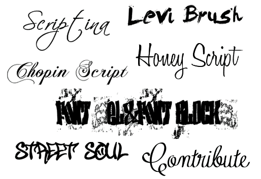
Considered to be decorative fonts, script typefaces are meant to appear as if they are handwritten. They are very pretty and have a lot of visual appeal, but they do not serve well as advertising fonts. They lack readability and don’t work well for body copy, however, some marketers use casual script typefaces in ads. Script fonts are extremely fluid and have strong personalities.Script typefaces are commonly used in wedding invitations because of their prettiness. Always choose script fonts carefully and only use them when displaying minimal text.
There are many types of script typeface families, including casual scripts like Black Jack, Calligraphic Script and Formal Script. A popular type of Calligraphic Script typeface is Bombshell Pro.
Here’s a look at script fonts:
Pay Attention to Context
All the factors of your brand’s logo should work together. The font, the colors, the pictures, and the content should all make one cohesive image. If they juxtapose too sharply, customers might be put off of your brand. Even if just one thing is off, it can ruin your image. This is why it’s so important to pay attention to context.
Paying attention to context should be a top priority among all of your visual content efforts. You have to remember that everything you do impacts your visual identity. Even the layouts of your blog posts influence your audience’s perception. Cluttered and squished content makes it difficult for the audience to read your text. And you only complicate matters further when you choose the wrong font type.
If you’re thinking to yourself, “But I’m not a design expert and have no idea how to pick the right font,” then don’t feel alone. This is why visual content marketing agencies exist.
If you need help choosing the right font for your advertising content — even your blog posts — make sure to contact IGW today. We happen to have a few graphic design gurus who can help with all of your visual content needs.
Fonts also play a surprisingly large role in the creation of NFT collections. To learn more, and see why IGW is your go-to NFT Agency, drop us a line.

