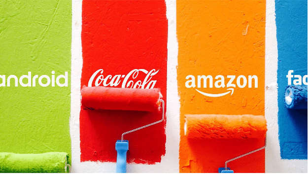
Improving communication with your customers starts with understanding how they learn.
Science shows that humans are visual creatures. Some studies even indicate that we process visuals not twice as face as the written word, but a mind-blowing 60,000 times faster. For content marketers, it’s essential to understand at least the basics of color psychology and how they can use it to evoke emotion and achieve higher conversions.
As we explore the basics of color psychology in marketing, let’s not forget that even though it’s one of the more interesting aspects of advertising and promotion, it’s also one of the most controversial.
Why? Because many conversations covering color psychology in marketing are based on anecdotal evidence and personal perceptions.
None of the information below is meant to serve as a definitive guide to branding and marketing. However, science does show that color psychology plays a large role in moving your customers through the buyer’s journey.
What Is Color Psychology in Marketing?
Color psychology aims to study how colors impact human behavior and decision-making. Colors influence our perceptions, many of which are not obvious, such as when you’re tasting food.
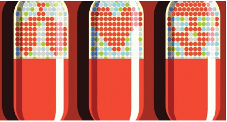
Studies also show that colors can heighten the effectiveness of placebos. When giving study participants a placebo in place of a stimulant, researchers will often give them a red or orange pill because both of these colors are associated with stimulation.

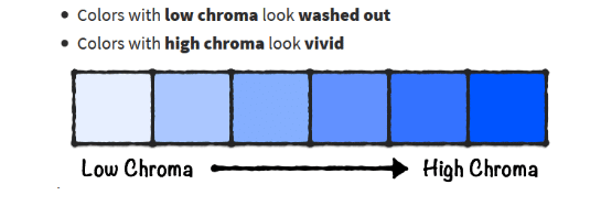
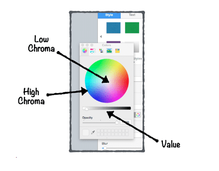
Although colors most certainly influence emotion and decision-making, the exact effects of each color tend to vary from person to person. Gender, age and culture play a significant role in the perception of color.
Why Study Color Psychology?
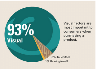
93% of a person’s purchasing decision is based on the product’s visual aspects.
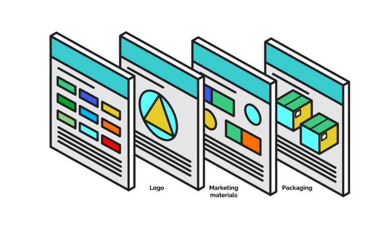
To achieve the highest impact, make the colors that you choose to represent your brand consistent across your logo, products, website, email communications, etc. Any marketing materials that you distribute should include your brand’s colors as well, including infographics, videos, whiteboard animations, and brochures.
A Close Look at the Rainbow
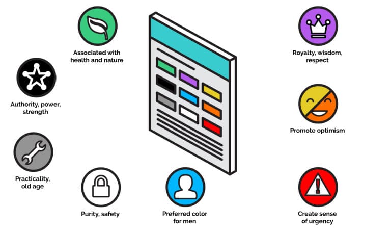
Red

 Orange

Yellow
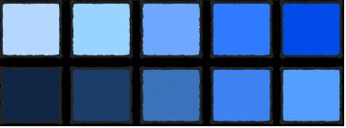
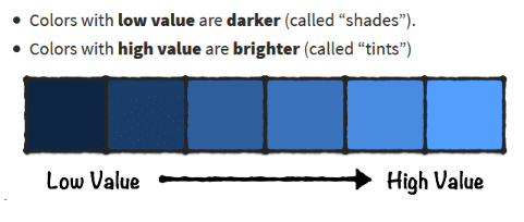
Yellow inspires creativity, happiness, intellect and optimism. It can also evoke emotions of fear, cowardice and irrationality. When using yellow, it’s very important to be careful with its hue and value, as some shades can look dirty while other tints of yellow can be difficult on the eyes.
Green

 Blue
Blue

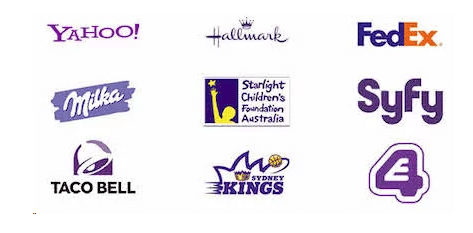
 Purple
 Pink
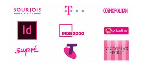
Pink
 Color Psychology in Marketing: The Importance of Context
Colors guide our eyes by showing us where to look, instill a sense of what we should do, and help us interpret the message being shared. Ultimately, it puts the content into context.
For example: You can’t always say that green means “calm.” Some brands use the color green when seeking support for environmental issues. Other brands use it to promote themselves as technological leaders.
Another example can be seen with the color brown. Brown is great for achieving a rugged appeal. A company that uses brown effectively is Saddleback Leather. Yet it’s also used by many in the food industry around Thanksgiving time to stir the audience’s appetite (think of all those chocolate commercials you see around the holidays).
The point is, there is no one-size-fits-all approach to colors and branding. You must consider the context of your brand, including your mission and objectives, when leveraging color psychology in marketing.
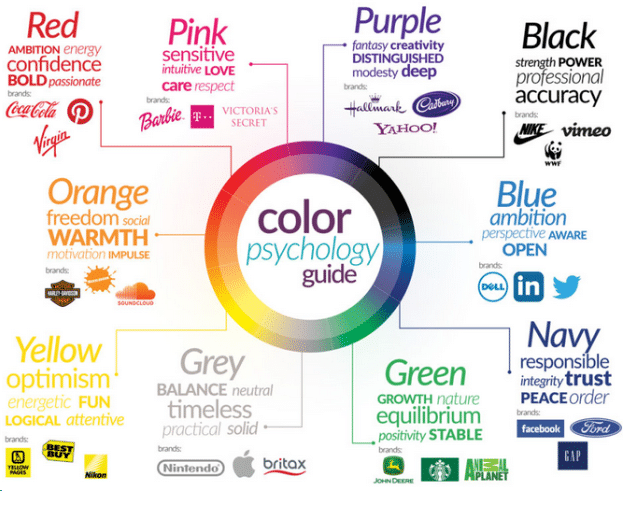
Visual marketing is a core component to achieving higher conversions, but color psychology doesn’t have any definitive laws or rules. You’ll always need human intelligence to guide your creative process when creating visual marketing assets, including those consisting of color psychology, to truly connect with your audience in a way that moves them through the buyer’s journey.
Want to learn more about color psychology and how you can use it to improve your marketing efforts? Contact IGW today!



 Orange


 Blue
Blue Purple
 Pink
Pink Color Psychology in Marketing: The Importance of Context