Our last couple of blog posts have focused heavily on data visualization. We’ve already discussed the benefits of data visualization and data storytelling, as well as how to make smart business choices with data visualization techniques. For this blog post, we’re going to dive right in by exploring six data visualization software programs. Each of these software programs provides what we find to be some of the best data visualization tools and features available.Effective data visualization is not for the faint of heart. However, you don’t have to be a data visualization guru to take advantage of it. When used strategically, data visualization and data storytelling are a golden marketing strategy. Here’s a look at the top six data visualization software programs that make data visualization very straightforward.
ZoHo Analytics
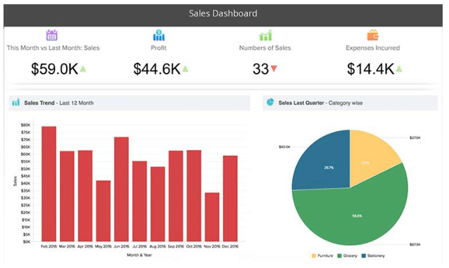
Along with pivot tables and a long list of KPI widgets, Zoho Analytics’ tabular view components allow you to generate reports that highlight deep business insights. This cloud-based program makes collaboration and communication a cinch. Users can even embed reports or dashboards into their blog posts, website landing pages, apps, and more.
Security is of no concern with Zoho Analytics. You’ll enjoy the program’s encrypted connection and state-of-the-art security measures.
Tableau
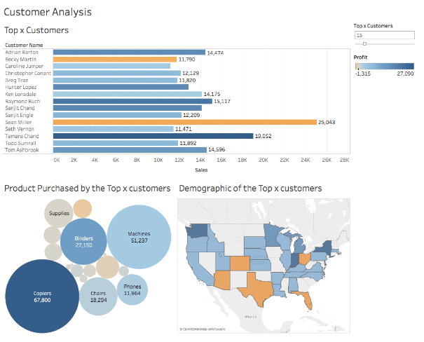
Known as the grand master of data visualization tools and software, Tableau has more than 57,000 users. The program’s easy-to-use dashboards also make it simple to generate interactive visualizations.
Probably the most notable advantage of Tableau is its ability to integrate with advanced database solutions like SAP, Hadoop, My SQL, Teradata, and Amazon AWS. This makes the program a top pick among those working with huge, fast-changing datasets, machine learning, and artificial intelligence.
Chart Studio
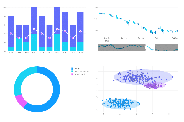
Chart Studio earns a spot on our list of the top data visualization software programs because of its online chart creation tool and extensive visualization library. You can create everything from dashboards to charts to interactive presentations with Chart Studio. Run customized analyses by importing data or by using Excel, JavaScript, MATLAB, and other programs.
Chart.js
You can create only eight chart types with Chart.js. However, this open-source charting library is perfect for small projects. Its use of HTML5 canvas elements gives you an uncomplicated way to create responsive charts and flat designs. Even better, you can generate mixed charts — a single chart made out of two or more chart types.
FusionCharts
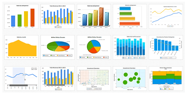
This JavaScript-based data visualization software allows you to create 90 different chart types. It integrates with numerous platforms and frameworks while giving you the ability to work from templates. You simply plug your data into a template and the program creates stunning visual content.
The FusionCharts SUITE XT software package comes with four products — FusionMaps XT, FusionCharts XT, PowerCharts XT, and FusionWidgets XT.
We particularly like PowerCharts XT because it supports domain-specific usage. This allows you to create network diagrams, stock price plots, profit-loss analyses, hierarchical structures, and more. To top it off, PowerCharts XT’s visually editable charts make it simple to simulate what-if scenario charts.
InstantAtlas
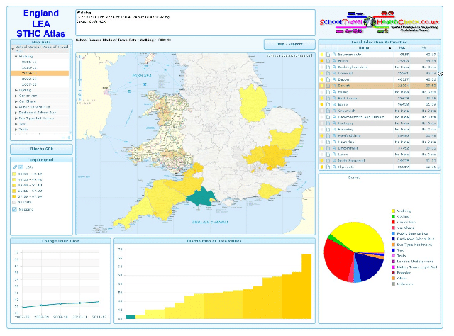
InstantAtlas is definitely worth checking out if you need data visualization software that supports mapping. This program simplifies the process of creating highly interactive profile reports. Thanks to its ability to combine map data with statistics, you can quickly generate engaging data visualizations.
The Cambridgeshire County Council uses InstantAtlas and has a ton of great things to say about the software:
“We have been working with GeoWise for many years and previously used InstantAtlas Desktop, and whilst we still have access to this software to design and produce bespoke, one-off visualisations, InstantAtlas Extra now takes much of the strain of the core visualisations on insights that are routinely updated. This means the data is updated by InstantAtlas which is helpful from a resource perspective as we don’t have to spend time routinely uploading the latest data. The individual atlases that we used to produce through websites would take time a lot of time to prepare. As the core visualisations are updated automatically, we can spend more time preparing the more specific and interactive bespoke maps and reports. We also don’t have to worry about hosting and from a finance perspective. Not having to rely on another third party for hosting is a benefit.”
Why Do Businesses Use Data Visualization Software?
There’s been a huge increase in leveraging data to improve products and services. When using data visualization software, it becomes simple to organize this data to find hidden insights relating to day-to-day transactions. From daily site visits to purchasing decisions to company sales, businesses use data visualization tools to present their data in user-friendly visuals.
It was just last year (2018) that an array of businesses used some of the best data visualization tools to perform a wide range of data visualization best practices. A few of these best practices included:
- Data profiling
- Standardized methodology
- Data presentation based on the audience
- Clear classification of visualizations
Tableau’s 2019 Business Intelligence Trends Report says 2019 is a year focused on utilizing data visualization software for visual storytelling during the analytics process. For example: Researchers and analysts are leveraging scrolling or multi-page dashboards to present step-by-step methods showcasing their analysis’ progression.
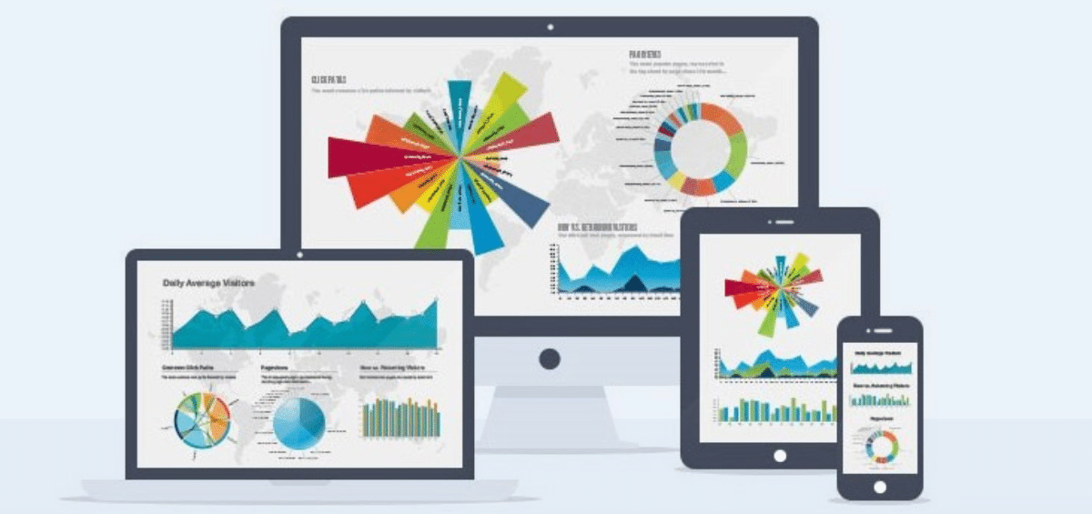
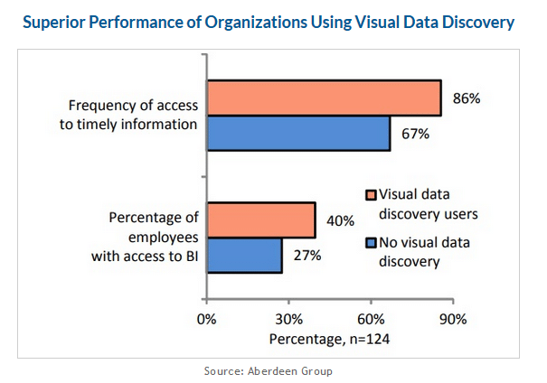
If you have yet to board the data visualization wagon, perhaps it’s time to make the jump. The visual below shows just how prominent data visualization has become.
 Features to Look for in Data Visualization Software
Effective data visualization starts with the user and the software. When shopping for data visualization software, make sure to look for the following features.
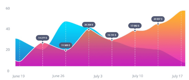
- Ability to choose different visuals and graphs: A scatter chart isn’t going to work for every message you want to share. This is why you need a data visualization software program that makes it easy to choose among an extensive list of charts, graphs and visuals.
- Trend tracking capability: This feature facilitates keeping track of different trends occurring in your field, such as which products are selling the best each month and who is buying them.
- High level of security: The data you store in your data visualization software program is very valuable, thus being a reason hackers will want to get their hands on it. Any data visualization tool you use should protect your data with today’s latest security measures.
- Simplified software interfacing: Data visualization, because it utilizes massive amounts of data, can become confusing very quickly. With a simplified software interface, it becomes possible to use the system right away without confusion.
Are you ready to start using data visualization software to make informed business decisions? You can also use data visualizations tools as part of your content marketing strategy. Although, even with the easiest to use data visualization software, you may find yourself overwhelmed. Creating effective data visualizations can be time-consuming, as well. If you need help generating reports and creating visual content, contact IGW today.

 Features to Look for in Data Visualization Software