Your brand’s visual identity is about so much more than the logo and color scheme on your website. While different businesses have different needs when creating a visual identity, there are a few basics that apply to all brands.
Use our guide to discover the basics of visual identity, including how it impacts conversions, how to create original visual assets, and top ways to make use of your new visual identity. Understanding the various components of your visual identity is crucial to your content marketing efforts, and this applies regardless if you’re a new business or in the middle of rebranding.
Why Do You Need a Visual Identity?
From the moment a consumer or another business first comes in contact with your brand, they develop an opinion about you. For most brands, this opinion is never reflected upon again. Think about how many brands you know. Now, think about all of the brands you’ve come across that you can’t remember. Some researchers say there are at least half a million big recognizable brands. That’s a lot!
To ensure that your brand image sticks in the minds of consumers and other businesses, it’s pertinent to create an effective visual identity. Most of a person’s impression of your brand image is not going to come as a result of them sitting around and thinking about it. It’s most likely going to come as a result of them simply glancing at your marketing campaigns. With a visual identity that sticks in a person’s mind, you have mastered the ability to instill brand image recall.
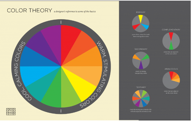
The key to creating an impressive visual identity is to resonate with your audience on an emotional level. This is why color psychology is so important when building a visual identity. Using certain colors, you can trigger emotions that build a bridge of trust and dependability with your audience. Make sure to read Color Psychology: What Colors Mean in Marketing for a better understanding of how to use colors to trigger emotion.
Why Does High-Converting Visual Marketing Matter to Visual Identity?
A high-converting visual identity isn’t all about what it looks like. In fact, it’s more about what it accomplishes. Your visual identity needs to have a purpose, and this purpose needs to help you achieve both your current and future objectives. To create an effective visual identity, you’ll need to make it:
- Flexible: Make sure the identity can be expanded upon as you scale your business and start offering more products and services.
- Reflective: It should align with your brand’s personality, values and mission.
- Intuitive: Partner with a visual marketing agency to help you create an identity that doesn’t look amateur. All elements should complement one another while achieving a purpose.
Even if you’re a one-man band operating as a successful solo entrepreneur, you’re going to need a team of professionals in your corner who excel in high-converting visual marketing.
To create a high-converting visual marketing campaign that enhances your visual identity at the same time, follow these helpful tips:
Use Various Forms of Visual Content
There are so many marketers who fail to leverage their existing content to its fullest potential. Don’t be one of them!
A high-converting visual marketing campaign is going to make use of each piece of content in multiple ways.
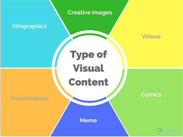
Let’s say you have a blog post that is performing really well. You can take that blog post and repurpose it into an infographic, whiteboard animation, explainer video, interactive content, and so much more. This gives you ample opportunity to achieve the highest conversion rate possible for that specific piece of content.
Appeal to Your Audience’s Emotions
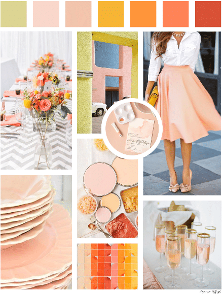
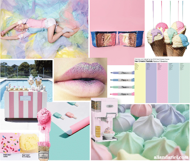
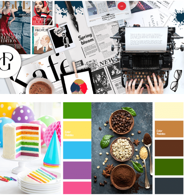
High-converting visual marketing appeals to the audience on an emotional level. You can use mood boards to help you refine your visual marketing efforts so that each visual asset evokes your intended emotion and response.
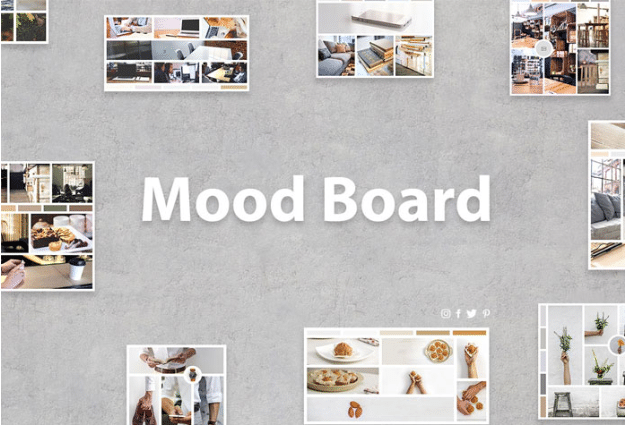
The image below is what a mood board looks like. It helps you create your marketing messages so that they trigger the emotion you are going after.
Since your audience’s emotions are at the heart of moving them through the sales funnel, you must ensure that all of your landing pages focus on their emotions instead of being overly promotional. Always make sure your audience and their pain points are the central focus of your landing pages, rather than your product.
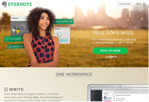
Evernote does a good job of creating landing pages that focus on emotion. The landing page shown below appeals to the audience’s emotions in several ways. It showcases a woman who is smiling because she is meeting her quarterly goals by using the product’s budgeting, planning and scheduling features.
Use Mood Boards for Your Visual Identity
You can use mood boards to not only shape your marketing efforts but also build your visual identity.
Let’s say you’re in the process of creating a logo for your brand image. Many professional designers and marketers use mood boards on a regular basis for design purposes. Without a mood board, you and your designer are essentially left at the mercy of hoping that the final logo turns out like you expect it. But here’s what happens, the designer will bring a logo to you, it won’t perfectly align with your expectations, so the designer goes back to the design board to make some tweaks. Sometimes, the designer might even start from scratch. This process is time-consuming.
Ultimately, without a mood board, there is no clear vision as to what you and the designer are hoping to create. With mood boards, a clear vision comes to life. Before you hire a designer, you should create a mood board to help him or her understand what you want your logo to look like. The same applies when you are creating new visual assets for marketing purposes. You and the design team can create a mood board to ensure everyone is on the same page.
Ian Paget with LogoGeek says, “It’s one hundred times easier and faster to change the mood board concept than it is to change finished logo designs.”


For more on creating a high-converting visual marketing campaign that helps you build a positive visual identity, check out What Does a High-Converting Visual Marketing Campaign Look Like.
The Secrets to Creating Original Visual Content
With your mood boards in place and a solid idea of what you want your visual identity to look like, you can now head to the design table. If you’re only an eCommerce store, you visual identity will appear almost entirely online. If you have brick-and-mortar offices and/or stores, then your visual identity will appear both online and in the real world.
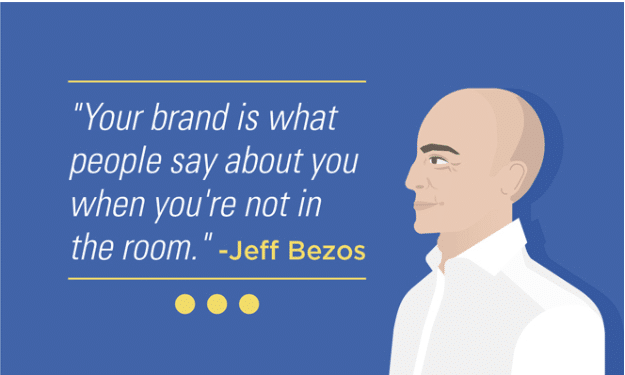
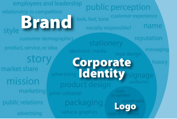
Keep in mind that your visual identity is all about the way your audience perceives you. There is a difference between brand identity and visual identity.
- Name
- Employees
- Location/building/SERPs
- Mission/values
- Your messaging
- Reputation
- Audience perceptions (both internal and external)
- Online presence
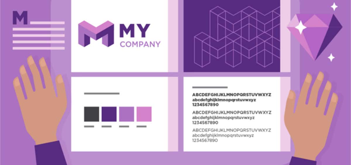
Your visual identity consists of your:
- Logo
- Photography
- Graphics
- Marketing materials
- Signage
- Typefaces
- Color palette
- Apparel
- Collateral materials
Creating an Original Infographic
Always use credible sources when creating an infographic. The research alone for your infographic will likely take a couple of days. Infographics are not a 20-minute asset, even though lots of sites say you can create one in that amount of time. Infographics that engage the audience and are share-worthy take much longer to create.
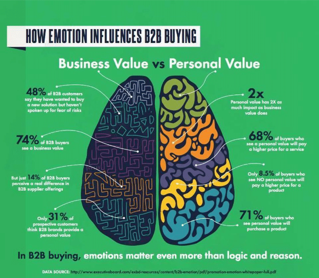
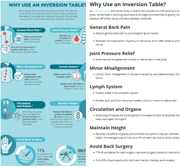
When creating the text for your infographic, remember that it needs to be somewhat minimal. Your text should support the visuals and not the other way around. To keep text to a minimum, use short sentences and lots of bullet points. Here’s an example of a finished infographic versus what your text should like when you’re putting together your research. Notice how in its finished form, the text supports the visuals.
You can team up with a professional visual marketing agency to create your infographic or you can use an infographic template. The latter, of course, costs less, but the finished product probably won’t be nearly as engaging as it would be if you let a team of content and design experts create the infographic for you.
Check out How to Create Original Visual Content to learn more about creating various types of visual assets that will help you build a positive visual identity.
Measuring Your Visual Identity Efforts
Remember how we said you need to use various forms of visual assets to create your visual identity? Well, using them isn’t enough. You must measure their results to ensure you are achieving the highest ROI. More so, when you measure them, you can improve conversion rate optimization.
Measuring your visual media marketing efforts is also crucial because it allows you to refine your visual identity.
Let’s say you have two social media video ads that you’re testing against one another. One version of the ad is performing at a much higher rate than the other version. The only difference between the two ads is that one has a green background and the other has a blue background. So, you start testing your other visual marketing efforts against one another using those two background colors.
After three months of testing, you realize that almost all of the assets with the green background perform better. Knowing this information is of the utmost value when creating a logo or when you’re in the middle of rebranding. It shows you that you should definitely be incorporating more green into your visual identity.
Check out How to Measure the Results of Your Visual Marketing Efforts to learn how you can use metrics to improve your visual identity.
The Top Reasons You Need to Use Visual Marketing
Your visual media marketing shapes your audience’s perception of your brand image. Your customers, in turn, spread their opinions of your brand image with other consumers, which further influences how effective your visual identity is.
Why do customers love visual marketing so much? Because it helps them understand your message.
If you publish a blog post explaining how to do something and you pair your instructions with visuals, your readers will find them 323% easier to follow than if they did not have visuals. Plus, text paired with visuals is easier to remember. Only 10% of text is remembered three days later. When you pair visuals with the text, roughly 65% of the information is remembered three days later.
Helping your customers remember what they read or look at is essential for brand image recall. Any time you have a key takeaway or an important piece of information you want your audience to remember, make sure to pair it with a visual. You can do this with infographics, graphics, photography, explainer videos, and more.
Here’s a closer look at the reasons you need to use visual media marketing for visual identity purposes:
- Infographics are shared 3x as much as other forms of content.
- 74% of marketers are already including visuals in their social media posts.
- An article with an image receives 94% more views when compared to those without visuals.
- Infographics drive site traffic by 12.
- 30% of marketers are already creating their own visuals.
For more on the many reasons your audience WANTS you to use visual marketing, check out Why Do Your Customers Love Your Visual Media Marketing Efforts.
Top Mistakes to Avoid When Creating a Visual Identity
Just because you have a visual identity doesn’t necessarily mean it’s an effective one. If it doesn’t result in brand image recall, you should definitely head back to the brainstorming room to refine your visual identity.
Brands commonly make many mistakes that blur the effectiveness of their visual identity. Some of these are small mistakes while others are large. From bad advertising fonts to poor color choices, these mistakes make it hard for brands to create a consistent visual identity that builds a bridge of dependability with their audiences. Even some of today’s major brands make these mistakes and don’t realize it.
Here’s a look at the top 10 visual identity mistakes and how to avoid them.
Failing to Use Your Buyer Persona
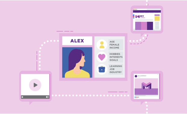
Always use your buyer persona when creating any type of visual asset. When leveraged correctly, this persona ensures that your visual identity speaks directly to your audience, which is pertinent to building loyalty and achieving higher conversions.
An Uncarefully Designed Logo
You can have a lot of fun when creating a logo, but there’s a lot of seriousness in making one as well. Anyone can use digital tools to create a logo, but if it doesn’t resonate with your audience and genuinely reflect your brand image, it’s meaningless. It also won’t help drive conversions.
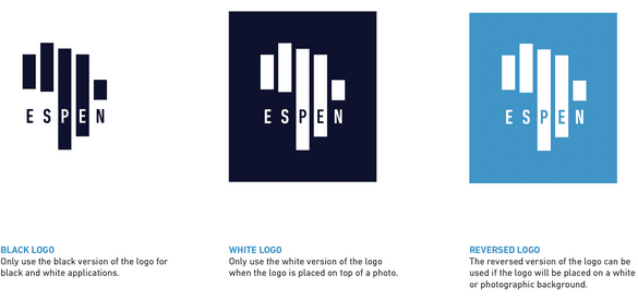
Your logo should reinforce your brand image, including its visual identity, mission and values. Here’s an example of three logo designs that truly reflect the Expanded Special Project for Elimination of Neglected Tropical Diseases, which is an organization that helps eliminate five types of tropical diseases. Notice how the bars, one for each disease, are in the shape of Africa. Also notice how the different versions can be used for specific types of marketing materials.
Not Using Your Brand Style Guidelines PDF
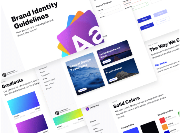
Any time you’re creating a visual asset, you should refer back to your brand style guidelines PDF. These guidelines will serve as the foundation for all of your visual asset creations. If you don’t have a brand style guidelines PDF, you need to create one This ensures that your visual assets will complement your visual identity. Your designers will be incredibly grateful for the brand style guidelines PDF, as it helps them move forward knowing they are headed in the right direction.
 Poor Web Design
Your website is at the heart of your visual identity. Unresponsive websites, poor favicons, and low-resolution images are just the beginning of poor web design. Your visual identity should not only be carefully planned, but it should be flexible as well. Just because your logo looks good on your website doesn’t necessarily mean it’s going to work well as a small social media profile image.
Also, just because your website performs good on a desktop doesn’t mean it’s been optimized for mobile viewing. These are crucial elements you must address to ensure your visual identity is leaving a positive, lasting impression.
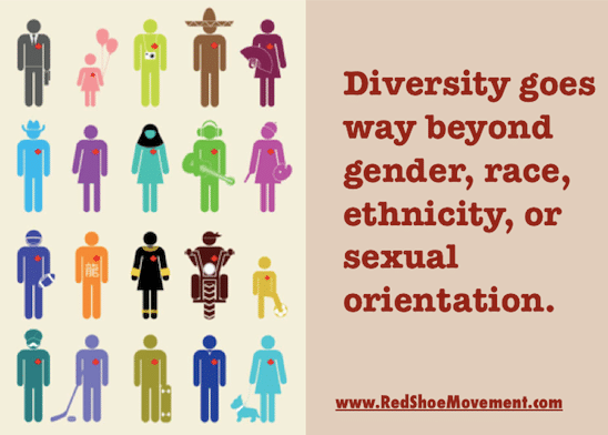
 Failing to Be Diverse in Your Imagery
Take a look at the images that you use on your website and in your marketing materials, including infographics, videos and social media posts. Are you representing diversity? When choosing and creating images, always do your best to be as diverse as possible.
 Poor Typography
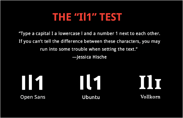
Typography gives you a way to add vibrance and life to your marketing message, but it can also quickly steer people away. If it’s too big or too small, your audience will click out of your site and go elsewhere to find what they are looking for. Just because a certain font is pretty and complements your visual identity doesn’t mean it’s easily legible by everyone.
Jessica Hische provides a great tip for helping you choose a font that can easily be read by just about anyone.
Your visual identity is greatly impacted by your audience’s ability to navigate your site. To ensure that your website is improving your visual identity instead of hurting it, give five random people the following tasks:
- Find a blog post in a certain category
- Find the Contact page
- Find the company contact information (this should appear on every page on your site)
- Find the Product/Services page
If the five people can’t easily fulfill all of those tasks, then there’s a good chance your website has poor navigation. Your web design team will need to revisit the site’s structure, including your use of headers, subheaders, imagery, tabs, body copy, etc. When a person lands on your site, they should easily be able to navigate to whatever page they want to visit.
Complicating Your Visual Identity
Colors are pretty. Colors trigger certain emotions. But too many colors will only complicate your visual identity. At the core of your visual identity should be:
- Two primary colors
- Three to five complementary colors
- Two accent colors
Are You Ready to Create a Visual Identity?
Creating an effective visual identity takes a lot of time and planning. If you need help with creating visual assets that complement your visual identity, please don’t hesitate to IGW.


 Poor Web Design
 Failing to Be Diverse in Your Imagery
 Poor Typography