Infographic Definition:
An infographic, short for “information graphic,” is a visual representation of data, information, or knowledge, designed to convey complex ideas or concepts in a simple, digestible manner. Infographics utilize various graphical elements, such as charts, icons, illustrations, and text, to present information in a visually appealing and easily understandable format. The primary goal of an infographic is to make complex information more accessible and engaging to a broader audience, by breaking down intricate ideas into visually compelling components.
Infographics have become increasingly popular in the digital age, as they offer a quick and effective way to communicate information to people with varying levels of expertise or familiarity with a given subject matter. They are often used in marketing, education, journalism, and various other fields where visual storytelling can help capture the viewer’s attention and aid in information retention. The versatility and effectiveness of infographics make them a valuable tool for communicating in today’s fast-paced, visually-oriented world.

History of Infographics:

The history of infographics can be traced back to ancient civilizations, where visual representations of information were used to depict complex ideas, events, or systems. Although the term “infographic” is a relatively recent invention, the concept of using visuals to communicate information has been an essential aspect of human communication for thousands of years.
One of the earliest known examples of infographics dates back to around 7500 BCE, with the discovery of prehistoric cave paintings in Lascaux, France. These paintings depicted animals, humans, and abstract symbols, which historians believe were used to tell stories, share information about hunting, and document important events.
In ancient Egypt, around 3000 BCE, hieroglyphics were used to represent words, sounds, and concepts through a combination of pictorial symbols and more abstract signs. Egyptian scribes would create elaborate wall carvings and papyrus scrolls, using these visual elements to record historical events, religious texts, and other important information.
During the Middle Ages, illuminated manuscripts served as a precursor to modern infographics. These manuscripts combined text with intricate illustrations, diagrams, and other visual elements to help readers better understand religious texts, scientific concepts, and historical events.
The 17th and 18th centuries saw the emergence of early statistical graphics and data visualization techniques. In 1686, Edmond Halley, an English astronomer, and mathematician, created the first known meteorological chart, mapping the trade winds and monsoons across the Atlantic and Indian Oceans. A century later, in 1786, William Playfair, a Scottish engineer and economist, invented the bar chart and the line graph, which are still widely used today.
In the 19th century, infographics continued to evolve, with the development of more sophisticated data visualization techniques and the rise of mass print media. One notable example is the work of Florence Nightingale, who created a polar area diagram, also known as a “coxcomb” chart, to demonstrate the causes of mortality during the Crimean War. Her groundbreaking work in data visualization helped to improve public health policy and medical practices.
Throughout the 20th century, advancements in technology and graphic design led to the rapid growth and widespread adoption of infographics in various industries. Newspapers, magazines, and other print media began incorporating more infographics to help readers digest complex information and statistics. As computers and design software became more advanced, infographics became even more sophisticated and visually appealing.
Today, infographics play a critical role in modern communication, particularly in the digital age. They are used across various industries and fields, including marketing, journalism, education, and social media. The rise of the internet and the increasing importance of visual storytelling have made infographics an essential tool for sharing information, engaging audiences, and simplifying complex ideas in a world overflowing with data.
In conclusion, the history of infographics demonstrates the enduring importance of visual communication in human society. From ancient cave paintings to modern data visualizations, infographics have evolved and adapted to meet the changing needs of our increasingly complex world, and they will likely continue to play a vital role in the way we share and understand information in the future.
21 Interesting Facts About Infographics

- Infographics are 30 times more likely to be read than text articles. (Source: HubSpot)
- Visuals are processed 60,000 times faster by the brain than text. (Source: 3M Corporation)
- 65% of people are visual learners. (Source: Social Science Research Network)
- Infographics can increase website traffic by up to 12%. (Source: DemandGen)
- An infographic is 3 times more likely to be shared on social media than any other type of content. (Source: Mass Planner)
- 40% of people respond better to visual information than text. (Source: Zabisco)
- Infographics have seen a 990% increase in usage from 2007 to 2022. (Source: Google Trends)
- Publishers that use infographics grow their traffic an average of 12% more than those that don’t. (Source: AnsonAlex)
- 90% of the information transmitted to the brain is visual. (Source: MIT)
- Infographics can help increase sales by 84%. (Source: Xerox)
- Tweets with images receive 150% more retweets than tweets without images. (Source: Buffer)
- Facebook posts with images see 2.3 times more engagement than those without images. (Source: Buzzsumo)
- Articles featuring an infographic received 72% more views than those without. (Source: Unbounce)
- The search volume for infographics increased by over 800% from 2010 to 2022. (Source: Google Trends)
- Infographics receive 3 times more likes and shares on social media than other types of content. (Source: Content Marketing Institute)
- 60% of marketers predict the use of infographics will continue to increase in importance as a content marketing format. (Source: Content Marketing Institute)
- 45% of B2B marketers identified infographics as the most engaging form of content. (Source: Siegemedia)
- The most popular type of infographic is statistical, accounting for 42.8% of all infographics created. (Source: Venngage)
- Infographics are shared three times more than other types of content on LinkedIn. (Source: LinkedIn)
- 74% of marketers rely on visuals in their social media marketing, making infographics a popular choice. (Source: Social Media Examiner)
- High-quality infographics are 30 times more likely to be read than text-only content, leading to increased engagement and information retention. (Source: HubSpot)
These statistics highlight the significant impact infographics have on content consumption, engagement, and information retention. By incorporating infographics in your content strategy, you can effectively reach and engage with your target audience.
 Commonly Asked Questions About Infographics
Q: How do you define infographics?
- A: Infographics are visual representations of data, information, or knowledge that are designed to convey complex information in a clear and engaging manner, using a combination of text, images, charts, and icons.
Q: What is infographics and example?
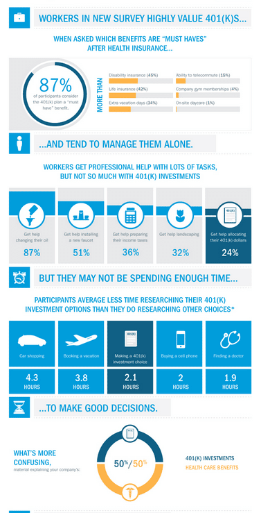
- A: An infographic is a visual representation of data or information, often used to simplify complex concepts or make data more digestible. An example of an infographic could be a chart showing the growth of social media usage over time, using colorful bars and icons to represent each platform.
Q: What are the 3 types of infographics?
- A: The three main types of infographics are statistical, informational, and process infographics. Statistical infographics display data and statistics, informational infographics present facts and explanations, and process infographics illustrate a sequence of steps or a workflow.
Q: What are the 5 elements of infographic?
- A: The five essential elements of an infographic are: a clear and concise title, engaging visuals, well-organized data, accurate and relevant information, and a clear narrative or flow that guides the viewer through the content.
Q: What is the main purpose of an infographic?
- A: The primary purpose of an infographic is to simplify complex information and present it in an engaging, visually appealing format that is easy for the audience to understand and remember.
Q: What are the three definitions of infographics?
- A: Infographics can be defined as:
- Visual representations of data or information.
- Tools that combine text, images, and design elements to convey complex information in a simplified manner.
- Engaging, easy-to-understand graphics that help viewers process and retain information more effectively.
Q: What are the 7 common types of infographics?
- A: The seven common types of infographics are statistical, informational, process, timeline, comparison, geographic, and hierarchical infographics.
Q: What is the difference between a poster and an infographic?
- A: A poster is a visual medium used to convey a message, promote an event, or present information, while an infographic is specifically designed to present complex data or information in a visually engaging and simplified format. Infographics often include charts, icons, and other visual elements, whereas posters may rely more heavily on text and images.
Q: What makes a good infographic?
- A: A good infographic has a clear purpose, presents accurate and relevant information, uses engaging visuals, follows a logical flow, and is easy for the viewer to understand and remember.
Q: What are the key elements of an infographic?
- A: The key elements of an infographic include a clear and concise title, engaging visuals, well-organized data, accurate and relevant information, and a clear narrative or flow that guides the viewer through the content.
Q: When should you use infographics?
- A: Infographics are best used when you need to present complex information, data, or processes in a simplified and engaging manner that is easy for the audience to understand and remember.
Q: What are the rules of infographic?
- A: Some rules of infographic design include having a clear purpose, using accurate and relevant information, organizing data effectively, creating engaging visuals, maintaining a consistent style, and ensuring the infographic is easy to read and understand.
Q: What not to do in an infographic?
- A: When creating an infographic, avoid using too much text, making it cluttered, using irrelevant or inaccurate information, using low-quality visuals, or creating a confusing layout that is difficult for the viewer to follow.


